
About
Hover/focus tooltip primitive from AI Dimensie, built on Radix UI Tooltip with Provider, Trigger, Content, and Arrow sub-components plus fade/zoom animations.
Built with React and Tailwind. Copy the prompt and paste it into Claude Code, Cursor or Lovable: your agent adds AI Dimensie Tooltip to your project and fits it to your theme.
Code
How AI Dimensie Tooltip is used: the demo's code. The component's own source comes with a free account.
Usage.tsx
import Component from "@/components/ui/ai-dimensie-tooltip"

export default function Demo() {
  return <Component />
}
Dependencies
More by Jason Mohab-Ali
View all

Alqemist Interactive Demo
9
Qreatify Super Agent Card
5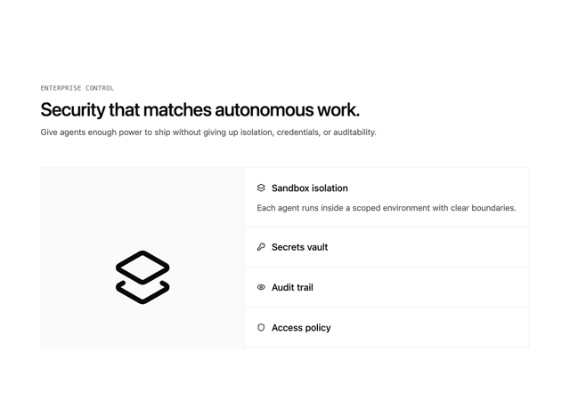
Alqemist Security
4
Alqemist Hero
4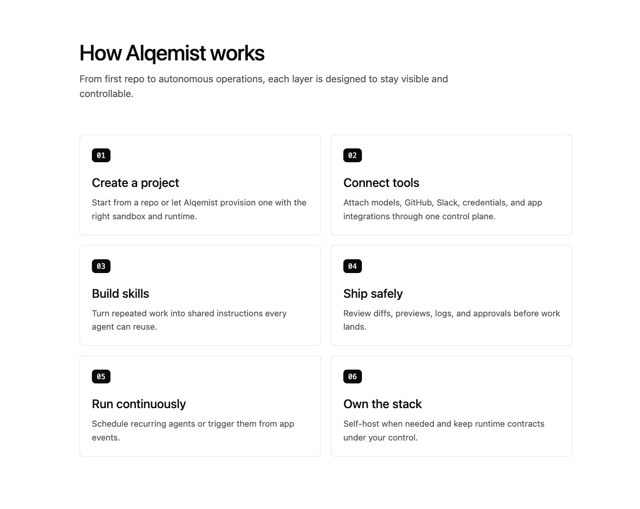
Alqemist How It Works
3
Alqemist Cta
2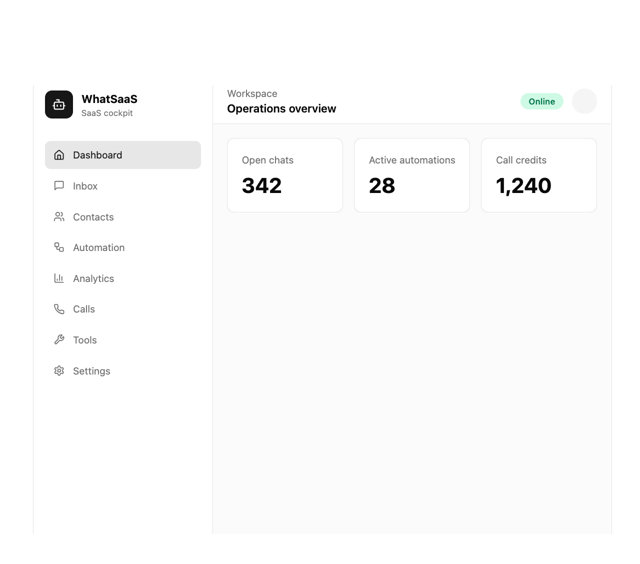
What Saa SApp Shell
2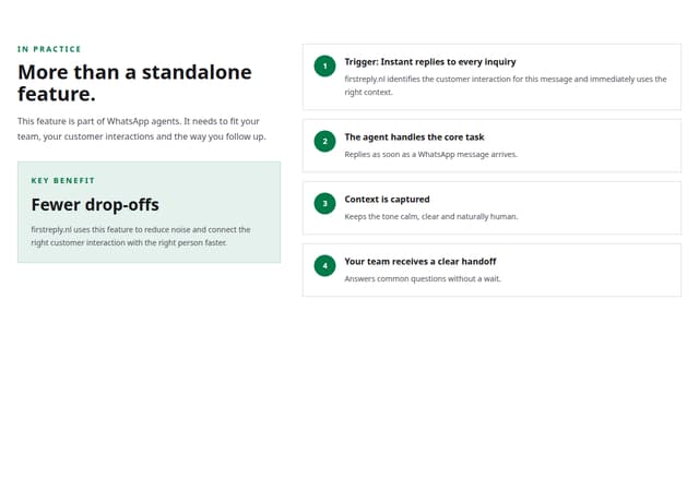
FirstReply Product Detail flow