
About
Generic contact form with 4 default fields (name, email, phone, message), optional contact-info sidebar with icon rows (phone/mail/pin/clock), submit button, in-flight state, and success state.
Built with React and Tailwind. Copy the prompt and paste it into Claude Code, Cursor or Lovable: your agent adds Contact Form to your project and fits it to your theme.
Code
How Contact Form is used: the demo's code. The component's own source comes with a free account.
Usage.tsx
import ContactForm from '@/components/ui/contactform'

export default function Demo() {
  return (
    <ContactForm
      title="Laten we samenwerken"
      subtitle="Heeft u een klus, offerte of vraag? Stuur ons een bericht en we reageren binnen 24 uur."
      contactInfo={[
        { icon: 'phone', label: 'Telefoon', value: '076 204 5474', href: 'tel:+31762045474' },
        { icon: 'mail', label: 'E-mail', value: 'info@voorbeeld.nl', href: 'mailto:info@voorbeeld.nl' },
        { icon: 'pin', label: 'Adres', value: 'Straatnaam 1, 4800AA Breda' },
        { icon: 'clock', label: 'Bereikbaar', value: 'Ma–Vr 08:00–17:00' },
      ]}
      onSubmit={async (data) => {
        console.log('demo submit:', data)
      }}
    />
  )
}
Dependencies
More by Jason Mohab-Ali
View all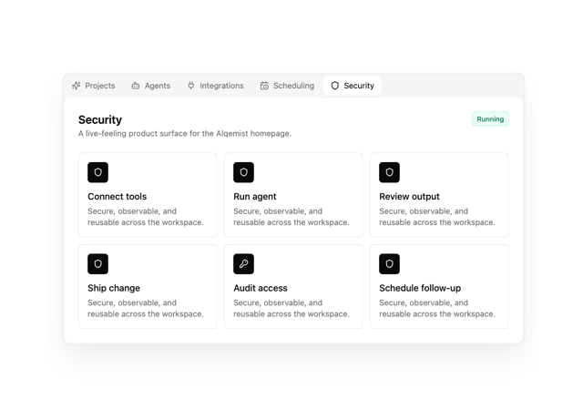

Alqemist Interactive Demo
9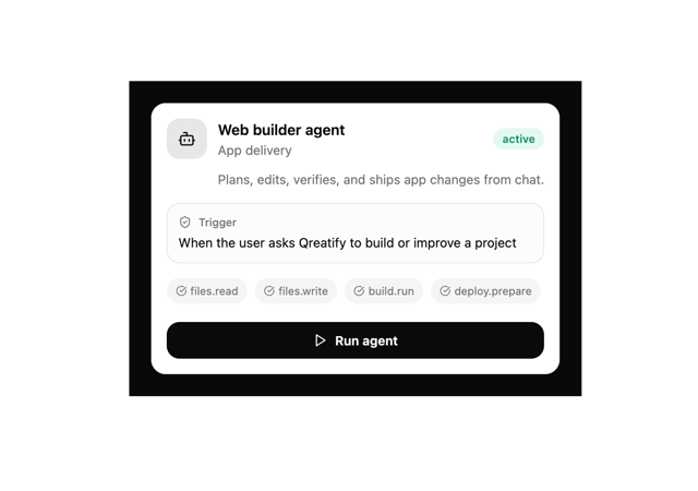
Qreatify Super Agent Card
5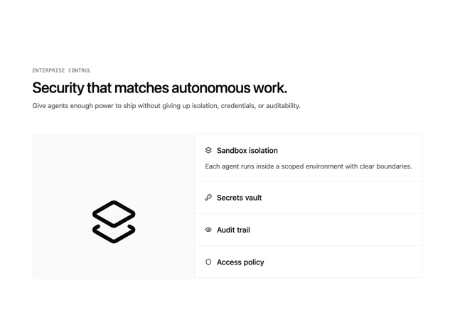
Alqemist Security
4
Alqemist Hero
4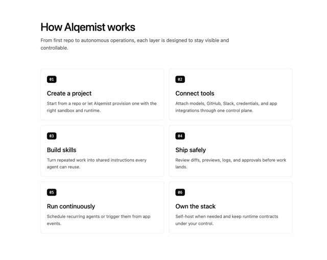
Alqemist How It Works
3
Alqemist Cta
2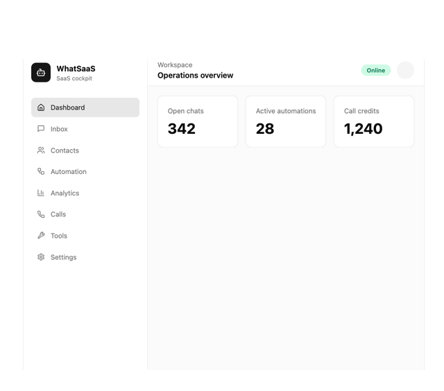
What Saa SApp Shell
2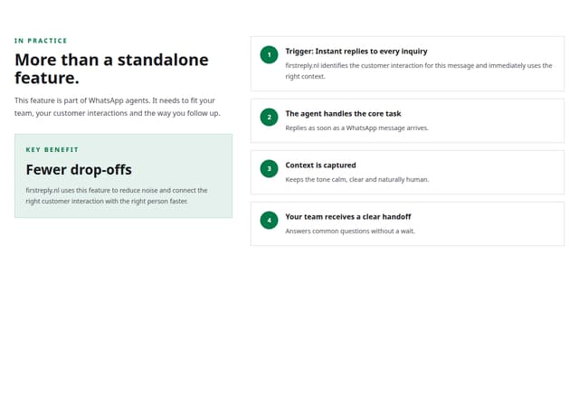
FirstReply Product Detail flow
More in Forms
View all

Premium Auth
500

Login 1
52

Book A Demo 3
83
Authentication Card
47

Contact Card
1K

Login Card
32
Book A Demo 1
69

Login 2
7
