
Brand theme tokens for Tailwind v4 + shadcn, themed for Smans Onderhoud / any construction/trade business site. Adds the brand-600 (#dc2626) red palette (50-950), surface tints (rose-50/100), display font, card + button radii, and brand-coloured shadows. Default export is a CSS string with @theme directives + root :root variables usable in any Next.js / shadcn project. Tailwind v4 picks up the @theme block; legacy CSS consumers can use the :root vars directly.
Built with React and Tailwind. Copy the prompt and paste it into Claude Code, Cursor or Lovable: your agent adds Smans Construction Theme to your project and fits it to your theme.
Code
How Smans Construction Theme is used: the demo's code. The component's own source comes with a free account.
Usage.tsx
import SMANS_BRAND_CSS from '@/components/ui/smans-brand-css'

export default function Demo() {
  return (
    <div className="space-y-6 p-8 bg-slate-50 max-w-3xl">
      <div className="flex flex-wrap gap-2">
        <div className="w-12 h-12 rounded bg-[var(--brand-50)] border" />
        <div className="w-12 h-12 rounded bg-[var(--brand-100)] border" />
        <div className="w-12 h-12 rounded bg-[var(--brand-200)] border" />
        <div className="w-12 h-12 rounded bg-[var(--brand-300)]" />
        <div className="w-12 h-12 rounded bg-[var(--brand-400)]" />
        <div className="w-12 h-12 rounded bg-[var(--brand-500)]" />
        <div className="w-12 h-12 rounded bg-[var(--brand-600)] ring-2 ring-offset-2 ring-[var(--brand-600)]" />
        <div className="w-12 h-12 rounded bg-[var(--brand-700)]" />
        <div className="w-12 h-12 rounded bg-[var(--brand-800)]" />
        <div className="w-12 h-12 rounded bg-[var(--brand-900)]" />
      </div>
      <pre className="text-xs bg-white border rounded p-4 overflow-auto">{SMANS_BRAND_CSS.slice(0, 480)}…</pre>
    </div>
  )
}
More by Jason Mohab-Ali
View all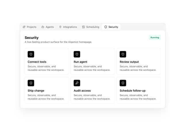

Alqemist Interactive Demo
9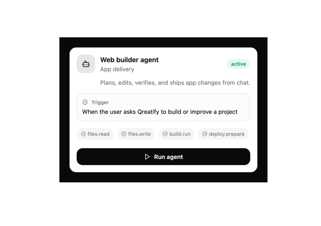
Qreatify Super Agent Card
5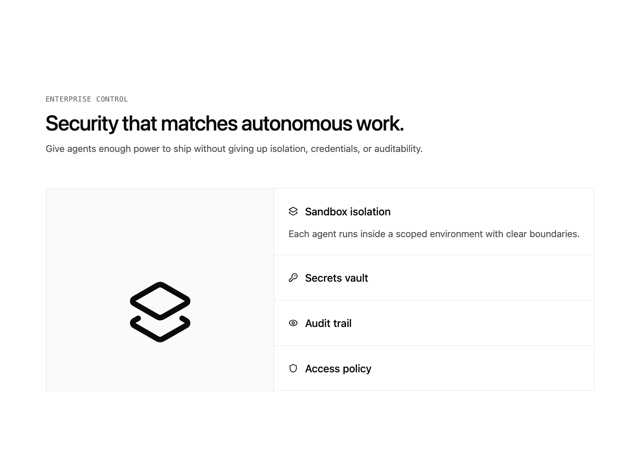
Alqemist Security
4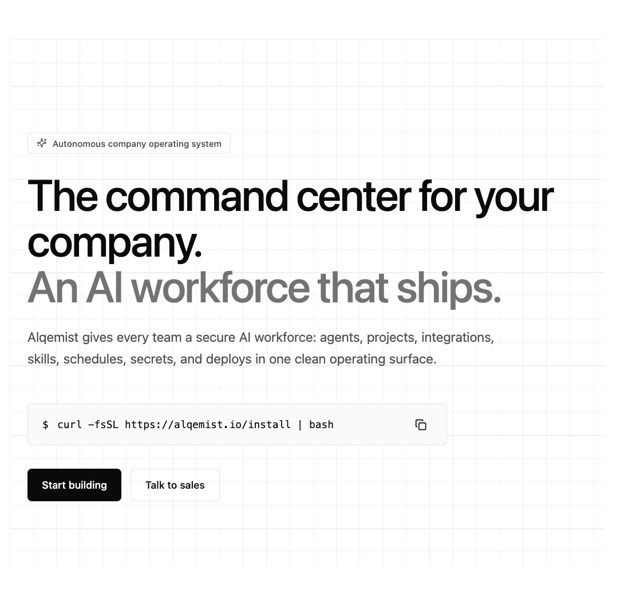
Alqemist Hero
4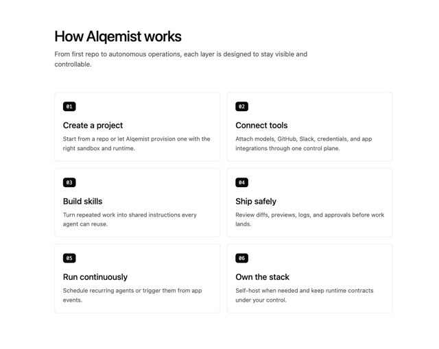
Alqemist How It Works
3
Alqemist Cta
2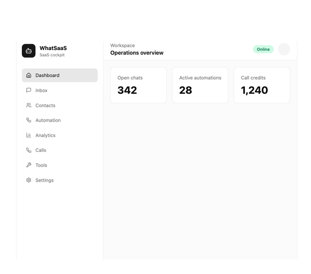
What Saa SApp Shell
2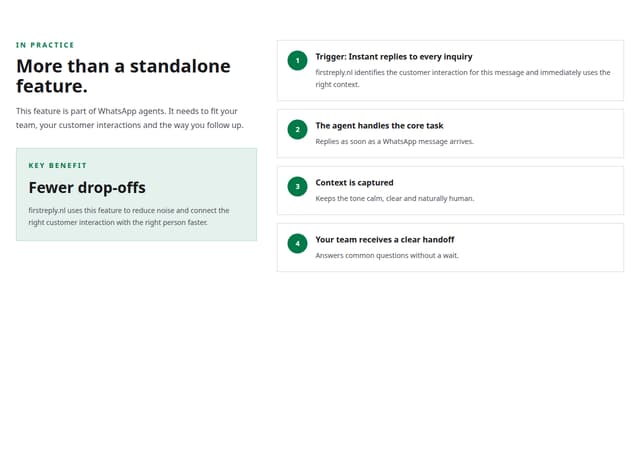
FirstReply Product Detail flow