
About
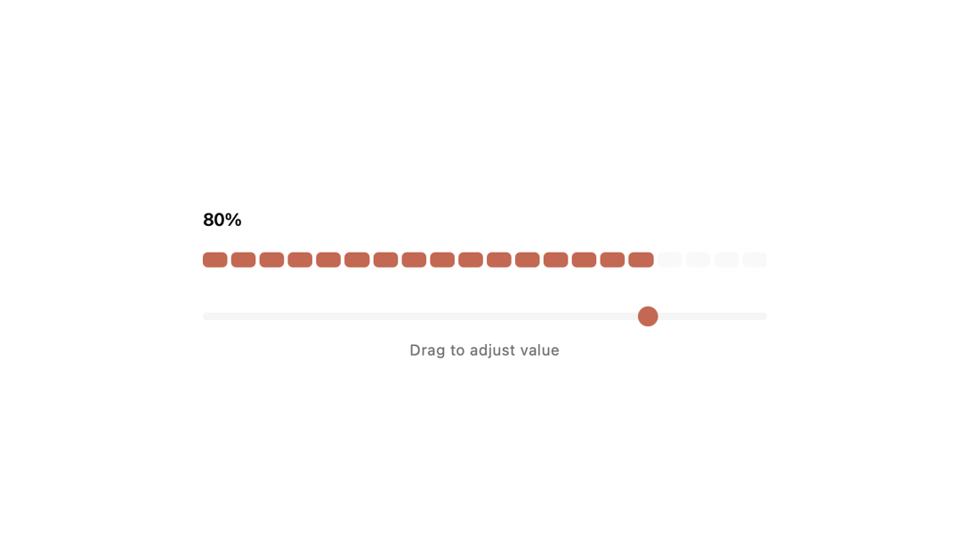
A beautiful segmented progress bar with rounded rectangular segments - filled segments in a terracotta/coral color and unfilled ones in dark gray.
Built with React and Tailwind. Copy the prompt and paste it into Claude Code, Cursor or Lovable: your agent adds Progress Bar to your project and fits it to your theme.
Code
How Progress Bar is used: the demo's code. The component's own source comes with a free account.
Usage.tsx
"use client"

import { SegmentedProgress } from "@/components/ui/progress-bar"

export default function Page() {
  return (
    <div className="min-h-screen bg-background flex items-center justify-center p-8 w-full">
      <div className="w-full max-w-md">
        <SegmentedProgress />
      </div>
    </div>
  )
}
More by Jatin Yadav
View all
Radial Orbital Timeline
7.4K
Expand Map
2.8K
Sign In Card
2.6K
Project Showcase
2.2K
Etheral Shadow
2.1K
Vapour Text Effect
2K
Animated AI Chat
1.6K
Vertical Image Stack
1.6K