
About
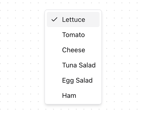
A ListBox displays a list of options and allows a user to select one or more of them. A listbox can be built using the <select> and <option> HTML elements, but this is not possible to style consistently cross browser. ListBox helps you build accessible listbox components that can be styled as needed.
Built with React and Tailwind. Copy the prompt and paste it into Claude Code, Cursor or Lovable: your agent adds List Box [react-aria-components] to your project and fits it to your theme.
Code
How List Box [react-aria-components] is used: the demo's code. The component's own source comes with a free account.
Usage.tsx
import { ListBox, ListBoxItem } from "@/components/ui/list-box"

export function ListBoxSelectionReplace() {
  return (
    <ListBox
      className={"max-h-[200px]"}
      aria-label="Sandwich contents"
      selectionMode="multiple"
      selectionBehavior="replace"
    >
      <ListBoxItem id="lettuce">Lettuce</ListBoxItem>
      <ListBoxItem id="tomato">Tomato</ListBoxItem>
      <ListBoxItem id="cheese">Cheese</ListBoxItem>
      <ListBoxItem id="tuna">Tuna Salad</ListBoxItem>
      <ListBoxItem id="egg">Egg Salad</ListBoxItem>
      <ListBoxItem id="ham">Ham</ListBoxItem>
    </ListBox>
  )
}
Dependencies
More by James Shopland
View all
Tag Group [react-aria-components]
91
Date Range Picker [react-aria-components]
85
Grid List [react-aria-components]
70
Switch [react-aria-components]
68
Select [react-aria-components]
46
Range Calendar [react-aria-components]
38
Popover
35
Slider [react-aria-components]
34