
About
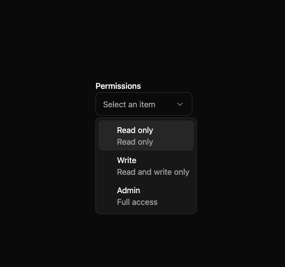
Here is Select component
Built with React and Tailwind. Copy the prompt and paste it into Claude Code, Cursor or Lovable: your agent adds Select to your project and fits it to your theme.
Code
How Select is used: the demo's code. The component's own source comes with a free account.
Usage.tsx
"use client"

import { Text } from "react-aria-components"

import { Label } from "@/components/ui/text-field-basic"
import {
  Select,
  SelectItem,
  SelectListBox,
  SelectPopover,
  SelectTrigger,
  SelectValue,
} from "@/components/ui/select-1"

export default function SelectTextSlots() {
  return (
    <Select className="w-[200px]" placeholder="Select an item">
      <Label>Permissions</Label>
      <SelectTrigger>
        <SelectValue />
      </SelectTrigger>
      <SelectPopover>
        <SelectListBox>
          <SelectItem
            textValue="Read"
            className="flex flex-col items-start justify-center"
          >
            <Text slot="label">Read only</Text>
            <Text className="text-sm text-muted-foreground" slot="description">
              Read only
            </Text>
          </SelectItem>
          <SelectItem
            textValue="Write"
            className="flex flex-col items-start justify-center"
          >
            <Text slot="label">Write</Text>
            <Text slot="description" className="text-sm text-muted-foreground">
              Read and write only
            </Text>
          </SelectItem>
          <SelectItem
            textValue="Admin"
            className="flex flex-col items-start justify-center"
          >
            <Text slot="label">Admin</Text>
            <Text className="text-sm text-muted-foreground" slot="description">
              Full access
            </Text>
          </SelectItem>
        </SelectListBox>
      </SelectPopover>
    </Select>
  )
}
Dependencies
More by James Shopland
View all
Tag Group [react-aria-components]
91
Date Range Picker [react-aria-components]
85
Grid List [react-aria-components]
70
Switch [react-aria-components]
68
Select [react-aria-components]
46
Range Calendar [react-aria-components]
38
Popover
35
Slider [react-aria-components]
34
More in Forms
View all

Premium Auth
500

Login 2
7
Authentication Card
47

Login 1
52

Contact Card
1K
Login Form
6

Form
16

Book A Demo 3
83
