
About
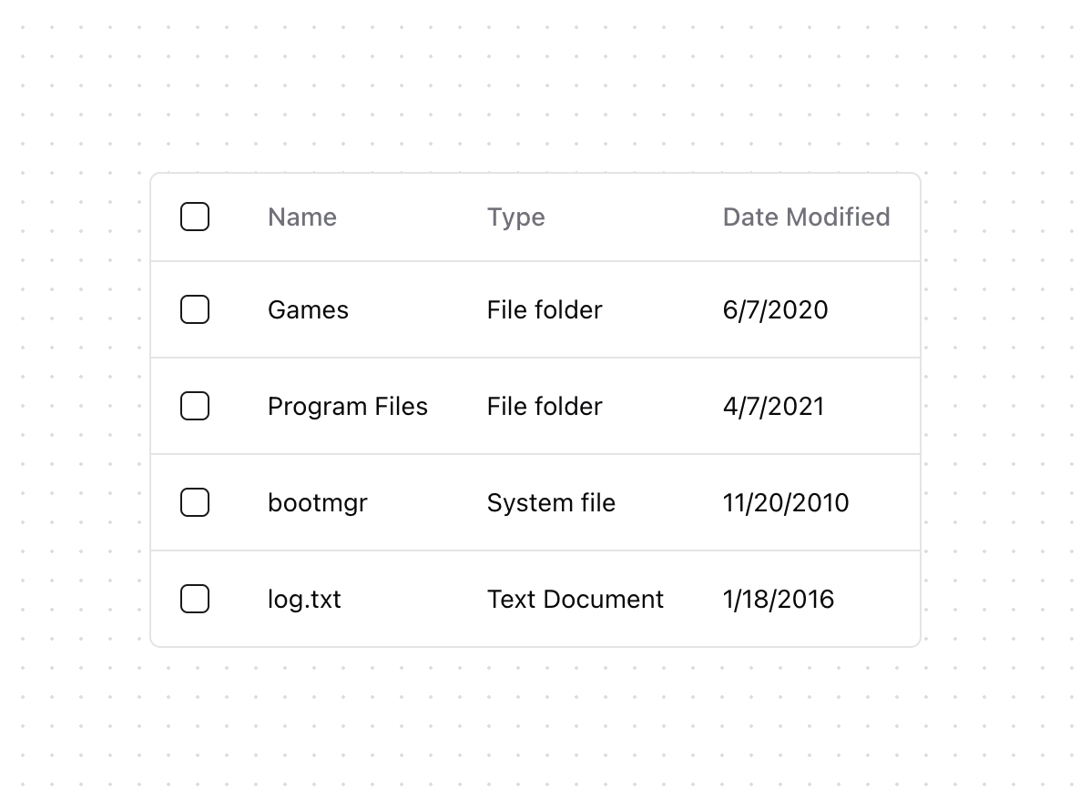
A table displays data in rows and columns and enables a user to navigate its contents via directional navigation keys, and optionally supports row selection and sorting.
Built with React and Tailwind. Copy the prompt and paste it into Claude Code, Cursor or Lovable: your agent adds Table [react-aria-components] to your project and fits it to your theme.
Code
How Table [react-aria-components] is used: the demo's code. The component's own source comes with a free account.
Usage.tsx
import { Checkbox } from "@/components/ui/checkbox"
import {
  Cell,
  Column,
  ResizableTableContainer,
  Row,
  Table,
  TableBody,
  TableHeader,
} from "@/components/ui/table"

export function TableDemo() {
  return (
    <div className="relative max-w-[600px] overflow-auto rounded-md border bg-background">
      <Table aria-label="Files" selectionMode="multiple">
        <TableHeader>
          <Column width={40} minWidth={40}>
            <Checkbox slot="selection" />
          </Column>
          <Column isRowHeader>Name</Column>
          <Column>Type</Column>
          <Column>Date Modified</Column>
        </TableHeader>
        <TableBody>
          <Row>
            <Cell>
              <Checkbox slot="selection" />
            </Cell>
            <Cell>Games</Cell>
            <Cell>File folder</Cell>
            <Cell>6/7/2020</Cell>
          </Row>
          <Row>
            <Cell>
              <Checkbox slot="selection" />
            </Cell>
            <Cell>Program Files</Cell>
            <Cell>File folder</Cell>
            <Cell>4/7/2021</Cell>
          </Row>
          <Row>
            <Cell>
              <Checkbox slot="selection" />
            </Cell>
            <Cell>bootmgr</Cell>
            <Cell>System file</Cell>
            <Cell>11/20/2010</Cell>
          </Row>
          <Row>
            <Cell>
              <Checkbox slot="selection" />
            </Cell>
            <Cell>log.txt</Cell>
            <Cell>Text Document</Cell>
            <Cell>1/18/2016</Cell>
          </Row>
        </TableBody>
      </Table>
    </div>
  )
}
Dependencies
More by James Shopland
View all
Tag Group [react-aria-components]
91
Date Range Picker [react-aria-components]
85
Grid List [react-aria-components]
70
Switch [react-aria-components]
68
Select [react-aria-components]
46
Range Calendar [react-aria-components]
38
Popover
35
Slider [react-aria-components]
34