About
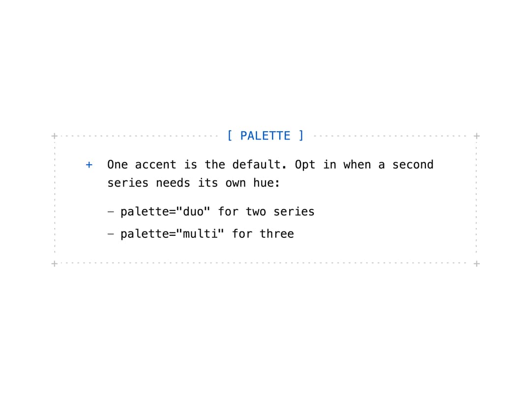
An MDX-style aside box between paragraphs for a note, tip, warning, or danger callout with a dot-grid ASCII-style frame.
Built with React and Tailwind. Copy the prompt and paste it into Claude Code, Cursor or Lovable: your agent adds Callout to your project and fits it to your theme.
Code
How Callout is used: the demo's code. The component's own source comes with a free account.
Usage.tsx
import Callout from "@/components/ui/callout";

export default function CalloutTipDemo() {
  return (
    <div className="flex w-full max-w-xl items-center justify-center p-8">
      <Callout type="tip" title="Palette">
        <p>
          One accent is the default. Opt in when a second series needs its own
          hue:
        </p>
        <ul>
          <li>palette="duo" for two series</li>
          <li>palette="multi" for three</li>
        </ul>
      </Callout>
    </div>
  );
}
Dependencies
More by keshav-exe
View all

Terminal