
About
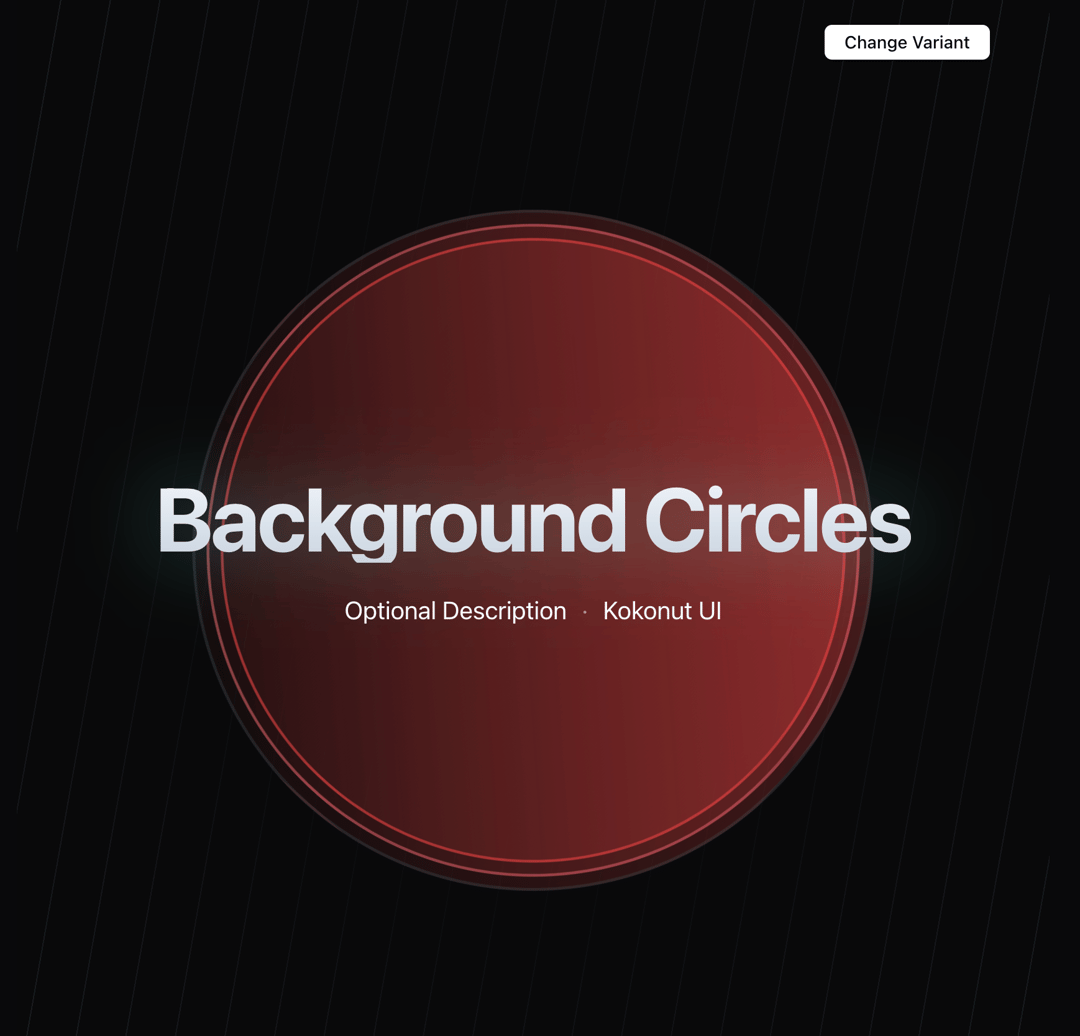
Built with React and Tailwind. Copy the prompt and paste it into Claude Code, Cursor or Lovable: your agent adds Background Circles to your project and fits it to your theme.
Code
How Background Circles is used: the demo's code. The component's own source comes with a free account.
Usage.tsx
"use client"

import { useState } from "react";
import { BackgroundCircles } from "@/components/component/background-circles"

export function DemoCircles() {
    const [currentVariant, setCurrentVariant] =
        useState<keyof typeof COLOR_VARIANTS>("octonary");

    const variants = Object.keys(
        COLOR_VARIANTS
    ) as (keyof typeof COLOR_VARIANTS)[];

    function getNextVariant() {
        const currentIndex = variants.indexOf(currentVariant);
        const nextVariant = variants[(currentIndex + 1) % variants.length];
        return nextVariant;
    }

    return (
        <>
            <BackgroundCircles variant={currentVariant} />
            <div className="absolute top-12 right-12">
                <button
                    type="button"
                    className="bg-slate-950 dark:bg-white text-white dark:text-slate-950 px-4 py-1 rounded-md z-10 text-sm font-medium"
                    onClick={() => {
                        setCurrentVariant(getNextVariant());
                    }}
                >
                    Change Variant
                </button>
            </div>
        </>
    );
}

export default { DemoCircles }

const COLOR_VARIANTS = {
        primary: {
            border: [
                "border-emerald-500/60",
                "border-cyan-400/50",
                "border-slate-600/30",
            ],
            gradient: "from-emerald-500/30",
        },
        secondary: {
            border: [
                "border-violet-500/60",
                "border-fuchsia-400/50",
                "border-slate-600/30",
            ],
            gradient: "from-violet-500/30",
        },
        tertiary: {
            border: [
                "border-orange-500/60",
                "border-yellow-400/50",
                "border-slate-600/30",
            ],
            gradient: "from-orange-500/30",
        },
        quaternary: {
            border: [
                "border-purple-500/60",
                "border-pink-400/50",
                "border-slate-600/30",
            ],
            gradient: "from-purple-500/30",
        },
        quinary: {
            border: [
                "border-red-500/60",
                "border-rose-400/50",
                "border-slate-600/30",
            ],
            gradient: "from-red-500/30",
        }, // red
        senary: {
            border: [
                "border-blue-500/60",
                "border-sky-400/50",
                "border-slate-600/30",
            ],
            gradient: "from-blue-500/30",
        }, // blue
        septenary: {
            border: [
                "border-gray-500/60",
                "border-gray-400/50",
                "border-slate-600/30",
            ],
            gradient: "from-gray-500/30",
        },
        octonary: {
            border: [
                "border-red-500/60",
                "border-rose-400/50",
                "border-slate-600/30",
            ],
            gradient: "from-red-500/30",
        },
    } as const;
Dependencies
More by Kokonut UI
View all

Background Paths
5.7K
Shape Landing Hero
3.5K
Beams Background
2.8K
Bento Grid
2.2K
v0 AI Chat
2.1K
AI Voice Input
1.7K
Hand Writing Text
1.3K
Action Search Bar
1.3K
More in Heroes
View all

SaaS Template
2.4K

Responsive Hero Banner
2K

Hero
1.2K
Centered Hero with Image Fan
931
Editorial Collage Hero
430
Glass Fold
212
Minimalist Hero Fashion
285

HeroSectionWithGradient
336
