
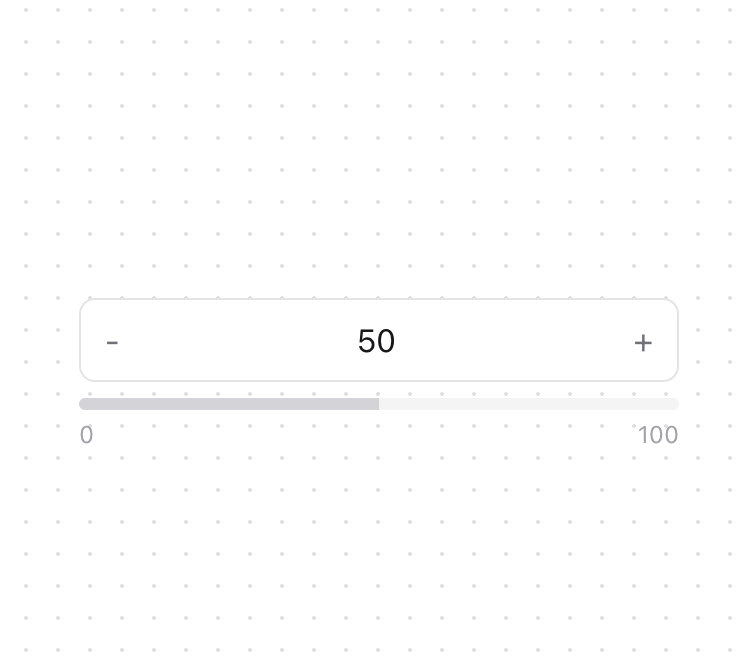
About
A customizable numeric input component with increment/decrement buttons and a visual progress indicator. Features - Input Controls - Increment/decrement buttons - Min/max value constraints - Custom step size - Default value support - Visual Feedback - Progress bar indicator - Focus states - Min/max labels - Dark mode support
Built with React and Tailwind. Copy the prompt and paste it into Claude Code, Cursor or Lovable: your agent adds Numeric Input to your project and fits it to your theme.
Code
How Numeric Input is used: the demo's code. The component's own source comes with a free account.
Usage.tsx
import { NumericInput } from "@/components/ui/numeric-input";

function NumericInputDemo() {
  return (
    <div className="block min-w-[300px]">
      <NumericInput />
    </div>
  );
}

export { NumericInputDemo };
More by Kokonut UI
View all

Background Paths
5.7K
Shape Landing Hero
3.5K
Beams Background
2.8K
Bento Grid
2.2K
v0 AI Chat
2.1K
AI Voice Input
1.7K
Hand Writing Text
1.3K
Action Search Bar
1.3K
More in Forms
View all

Premium Auth
500

Login 2
7
Authentication Card
47

Login 1
52

Contact Card
1K
Login Form
6

Form
16

Book A Demo 3
83
