
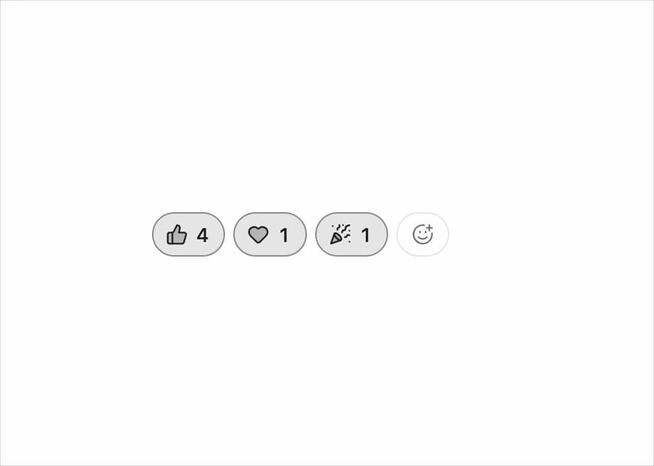
About
A row of reaction pills for comments, posts, or release notes, with animated counts and an emoji-style picker to add a new reaction.
Built with React and Tailwind. Copy the prompt and paste it into Claude Code, Cursor or Lovable: your agent adds Reactions to your project and fits it to your theme.
Code
How Reactions is used: the demo's code. The component's own source comes with a free account.
Usage.tsx
import Reactions from "@/components/ui/reactions";
import { Heart, PartyPopper, ThumbsUp } from "lucide-react";

const options = [
  { id: "like", label: "Like", icon: ThumbsUp },
  { id: "love", label: "Love", icon: Heart },
  { id: "party", label: "Celebrate", icon: PartyPopper },
];

export default function CommentReactionsDemo() {
  return (
    <div className="flex min-h-[300px] w-full items-center justify-center p-8">
      <Reactions
        options={options}
        defaultValue={[{ id: "like", count: 3, reacted: false }]}
        onValueChange={(_, change) => console.log(change)}
      />
    </div>
  );
}
Dependencies
More by kuratlielia
View all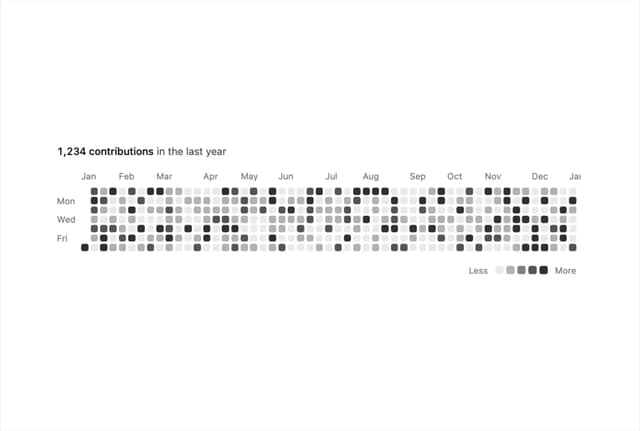
Activity Heatmap
341
Image Compare
104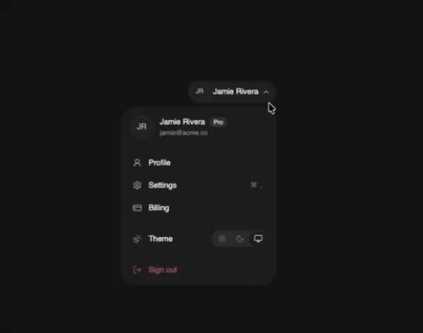
User Menu
93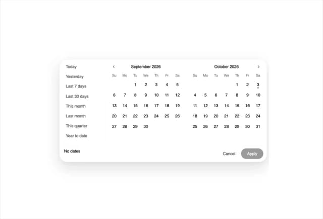
Date Range Picker
62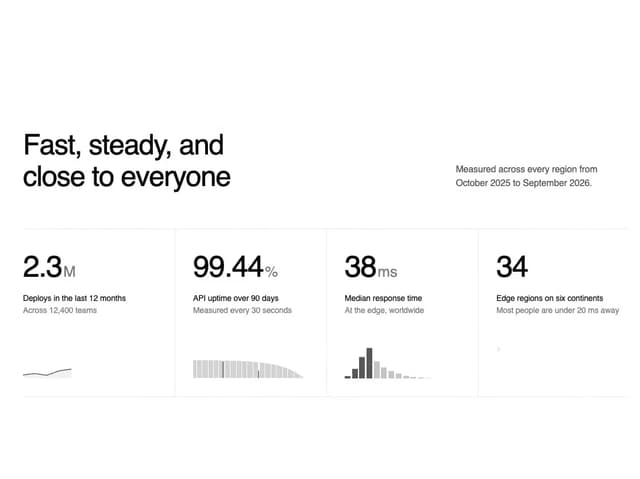
Stats Band
52
Usage Meter
45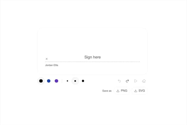
Signature Pad
37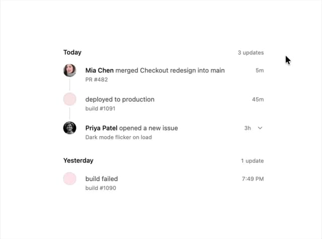
Timeline
33