
About
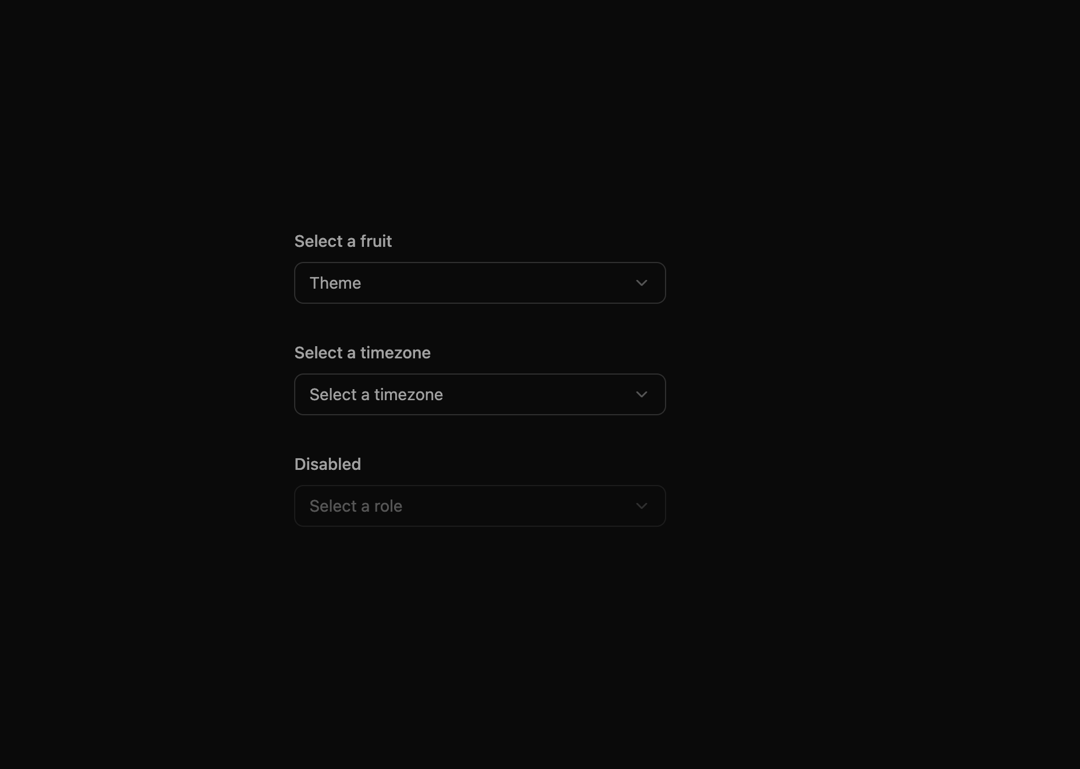
Here is modern select component by indevui
Built with React and Tailwind. Copy the prompt and paste it into Claude Code, Cursor or Lovable: your agent adds IndevuiSelect to your project and fits it to your theme.
Code
How IndevuiSelect is used: the demo's code. The component's own source comes with a free account.
Usage.tsx
// demo.tsx
import { Globe, UserCircle } from 'lucide-react';
import Select, {
  SelectContent,
  SelectGroup,
  SelectItem,
  SelectLabel,
  SelectSeparator,
  SelectTrigger,
  SelectValue,
} from '@/components/ui/indevui-select';

function SelectDemo() {
  return (
    <div className="flex flex-wrap items-end gap-8 p-4">
      <div className="w-full max-w-xs">
        <label className="mb-2 block text-sm font-medium text-muted-foreground">
          Select a fruit
        </label>
        <Select>
          <SelectTrigger>
            <SelectValue placeholder="Theme" />
          </SelectTrigger>
          <SelectContent>
            <SelectItem value="apple">Apple</SelectItem>
            <SelectItem value="banana">Banana</SelectItem>
            <SelectItem value="blueberry">Blueberry</SelectItem>
            <SelectItem value="orange" disabled>
              Orange (disabled)
            </SelectItem>
            <SelectItem value="strawberry">Strawberry</SelectItem>
          </SelectContent>
        </Select>
      </div>

      <div className="w-full max-w-xs">
        <label className="mb-2 block text-sm font-medium text-muted-foreground">
          Select a timezone
        </label>
        <Select>
          <SelectTrigger>
            <SelectValue placeholder="Select a timezone" />
          </SelectTrigger>
          <SelectContent>
            <SelectGroup>
              <SelectLabel className="flex items-center gap-2">
                <UserCircle className="h-4 w-4" />
                Personal Account
              </SelectLabel>
              <SelectItem value="est">Eastern Standard Time (EST)</SelectItem>
              <SelectItem value="pst">Pacific Standard Time (PST)</SelectItem>
            </SelectGroup>
            <SelectSeparator />
            <SelectGroup>
              <SelectLabel className="flex items-center gap-2">
                <Globe className="h-4 w-4" />
                Global
              </SelectLabel>
              <SelectItem value="gmt">Greenwich Mean Time (GMT)</SelectItem>
              <SelectItem value="cet">Central European Time (CET)</SelectItem>
            </SelectGroup>
          </SelectContent>
        </Select>
      </div>

      <div className="w-full max-w-xs">
        <label className="mb-2 block text-sm font-medium text-muted-foreground">
          Disabled
        </label>
        <Select disabled>
          <SelectTrigger>
            <SelectValue placeholder="Select a role" />
          </SelectTrigger>
          <SelectContent>
            <SelectItem value="admin">Admin</SelectItem>
            <SelectItem value="user">User</SelectItem>
          </SelectContent>
        </Select>
      </div>
    </div>
  );
}

export { SelectDemo as DemoOne };
Dependencies
More by LN
View all
Pricing Interaction
1.4K
Dorpdown Navigation
1.2K
Visualize Booking
618
Assisted Password Confirmation
585
Tags Selector
531
Mega Menu
386
Feedback Slider
326
FlipButton
288
More in Forms
View all

Premium Auth
500

Login 1
52

Book A Demo 3
83
Authentication Card
47

Contact Card
1K

Login Card
32
Book A Demo 1
69

Login 2
7
