
About
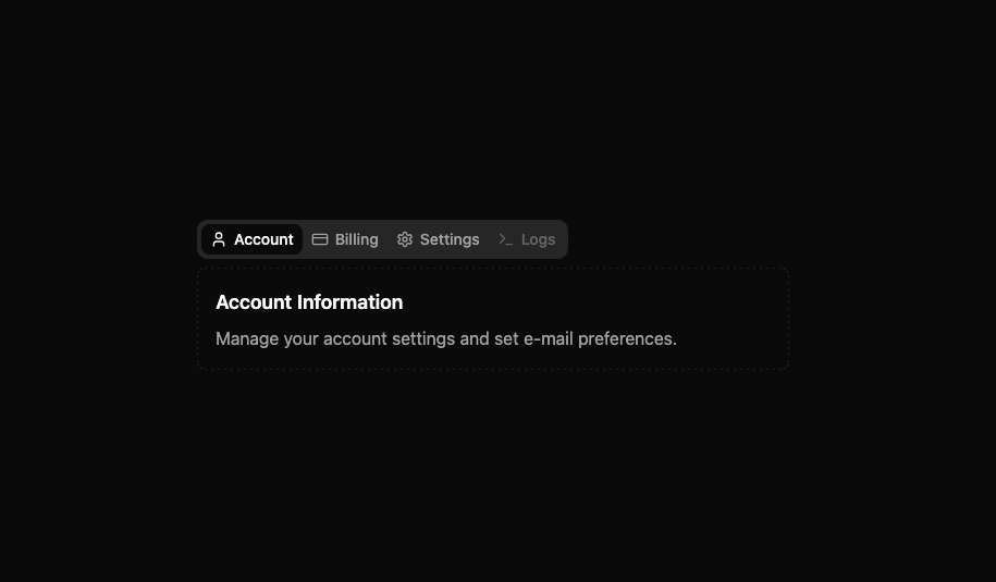
here is modern indev ui tabs component
Built with React and Tailwind. Copy the prompt and paste it into Claude Code, Cursor or Lovable: your agent adds indevuiTabs to your project and fits it to your theme.
Code
How indevuiTabs is used: the demo's code. The component's own source comes with a free account.
Usage.tsx
// demo.tsx
import { User, CreditCard, Settings, Terminal } from 'lucide-react';
import Tabs, { TabsContent, TabsList, TabsTrigger } from '@/components/ui/indevui-tabs';

function TabsDemo() {
  return (
    <div className="w-full max-w-xl p-4">
      <Tabs defaultValue="account">
        <TabsList>
          <TabsTrigger value="account">
            <User />
            Account
          </TabsTrigger>
          <TabsTrigger value="billing">
            <CreditCard />
            Billing
          </TabsTrigger>
          <TabsTrigger value="settings">
            <Settings />
            Settings
          </TabsTrigger>
          <TabsTrigger value="logs" disabled>
            <Terminal />
            Logs
          </TabsTrigger>
        </TabsList>
        <TabsContent value="account">
          <h3 className="mb-2 text-lg font-semibold">Account Information</h3>
          <p className="text-muted-foreground">
            Manage your account settings and set e-mail preferences.
          </p>
        </TabsContent>
        <TabsContent value="billing">
          <h3 className="mb-2 text-lg font-semibold">Billing Details</h3>
          <p className="text-muted-foreground">
            View your payment history and manage your subscription.
          </p>
        </TabsContent>
        <TabsContent value="settings">
          <h3 className="mb-2 text-lg font-semibold">Application Settings</h3>
          <p className="text-muted-foreground">
            Customize the application to fit your workflow.
          </p>
        </TabsContent>
        <TabsContent value="logs">
          <p>This content will not be displayed as the trigger is disabled.</p>
        </TabsContent>
      </Tabs>
    </div>
  );
}

export { TabsDemo as DemoOne };
Dependencies
More by LN
View all
Pricing Interaction
1.4K
Dorpdown Navigation
1.2K
Visualize Booking
614
Assisted Password Confirmation
585
Tags Selector
531
Mega Menu
385
Feedback Slider
325
FlipButton
284