
About
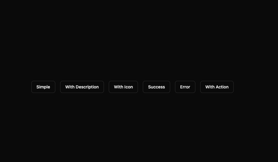
Here is toaster component by indevui
Built with React and Tailwind. Copy the prompt and paste it into Claude Code, Cursor or Lovable: your agent adds indevuiToaster to your project and fits it to your theme.
Code
How indevuiToaster is used: the demo's code. The component's own source comes with a free account.
Usage.tsx
// demo.tsx
'use client';

import { toast } from 'sonner';
import { Rocket } from 'lucide-react';
import Toaster from '@/components/ui/indevui-toaster';

function ToasterDemo() {
  const buttonClass =
    'inline-flex h-10 items-center justify-center whitespace-nowrap rounded-md border border-input bg-background px-4 py-2 text-sm font-medium ring-offset-background transition-colors hover:bg-accent hover:text-accent-foreground focus-visible:outline-none focus-visible:ring-2 focus-visible:ring-ring focus-visible:ring-offset-2 disabled:pointer-events-none disabled:opacity-50';

  return (
    <div className="flex flex-wrap items-center justify-center gap-4 p-4">
      <button className={buttonClass} onClick={() => toast('A simple toast message.')}>
        Simple
      </button>

      <button
        className={buttonClass}
        onClick={() =>
          toast('Event has been created', {
            description: 'Sunday, December 03, 2023 at 9:00 AM',
          })
        }
      >
        With Description
      </button>

      <button
        className={buttonClass}
        onClick={() =>
          toast.message('Custom Icon', {
            icon: <Rocket className="h-4 w-4" />,
          })
        }
      >
        With Icon
      </button>

      <button
        className={buttonClass}
        onClick={() => toast.success('Event has been created successfully!')}
      >
        Success
      </button>

      <button className={buttonClass} onClick={() => toast.error('Failed to create event.')}>
        Error
      </button>

      <button
        className={buttonClass}
        onClick={() =>
          toast('Are you sure?', {
            action: {
              label: 'Confirm',
              onClick: () => console.log('Confirmed!'),
            },
            cancel: {
              label: 'Cancel',
              onClick: () => console.log('Cancelled!'),
            },
          })
        }
      >
        With Action
      </button>
      <Toaster />
    </div>
  );
}

export { ToasterDemo as DemoOne };
Dependencies
More by LN
View all
Pricing Interaction
1.4K
Dorpdown Navigation
1.2K
Visualize Booking
618
Assisted Password Confirmation
585
Tags Selector
531
Mega Menu
386
Feedback Slider
326
FlipButton
288