
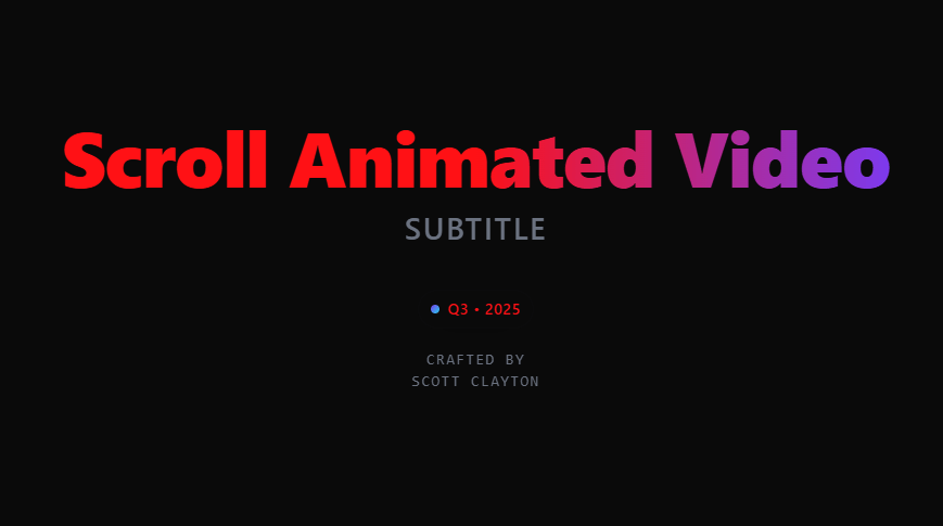
A production-ready React hero section built with GSAP ScrollTrigger and optional Lenis smooth scrolling, it auto-respects system dark/light mode and ships with a bold, modern typographic style. What’s inside Sticky, expanding media container (video or image) with depth darkening Overlay that reveals on scroll with caption, heading, paragraphs, and a slot for CTAs Headline “film-roll” exit animation Fully prop-driven API (layout, easing, blur, scroll length, toggles) System theme only (no manual overrides) via color-scheme + prefers-color-scheme Single-file component, SSR-safe dynamic imports (Next.js friendly) Clean teardown of ScrollTriggers/Lenis to prevent leaks
Built with React and Tailwind. Copy the prompt and paste it into Claude Code, Cursor or Lovable: your agent adds Scroll Animated Video to your project and fits it to your theme.
Code
How Scroll Animated Video is used: the demo's code. The component's own source comes with a free account.
Usage.tsx
import React from "react";
import HeroScrollVideo from "@/components/ui/scroll-animated-video";

export default function DemoOne() {
  return (
    <main>
      <HeroScrollVideo
        title="Scroll Animated Video"
        subtitle="Subtitle"
        meta="Q3 • 2025"
        media="https://cdn.21st.dev/assets/mirror/d1/d1a5ed8e2732afb190fc567594c675b264f828996aa4f0c22f56b9434af17547.mp4"
        overlay={{
          caption: "PROJECT • 07",
          heading: "Clarity in Motion",
          paragraphs: ["A focused reel highlighting interaction, craft, and intent."],
        }}
        // Force dark theme with custom palette
        themeMode="system"
      />
      <section style={{ minHeight: "150vh" }} />
    </main>
  );
}More by scott clayton
View all
Horizon Hero Section
4K
Full Screen Scroll FX
2K
Music Portfolio
675
Revolution Hero
455
Ethereal
404
Iphone Mockup
399
Music Reactive Hero Section
358
Interactive Map
341
More in Heroes
View all

SaaS Template
2.4K
Centered Hero with Image Fan
924

Hero
1.2K

Responsive Hero Banner
2K

Hero Section 6
881
Hero Golden Spiral
101

Home Section
65

Minimalist Hero Fashion
284
