
About
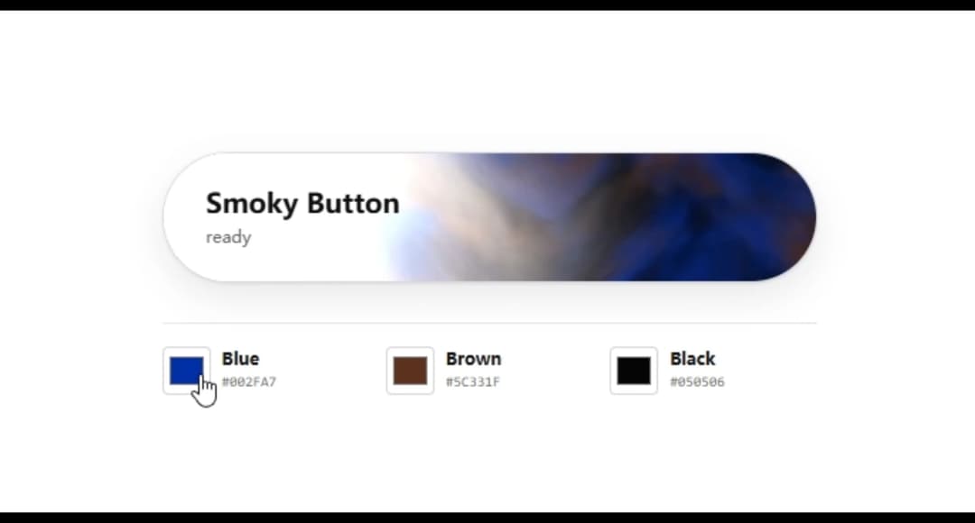
A WebGL-powered button with customizable, silk-like animated smoke.
Built with React and Tailwind. Copy the prompt and paste it into Claude Code, Cursor or Lovable: your agent adds Smoky Button to your project and fits it to your theme.
Code
How Smoky Button is used: the demo's code. The component's own source comes with a free account.
Usage.tsx
"use client";

import SmokyButton from "@/components/ui/smoky-button";

const colors = {
  primary: "#002FA7",
  secondary: "#5C331F",
  shadow: "#050506",
};

export default function DefaultDemo() {
  return (
    <main className="smoky-demo">
      <div className="smoky-demo__content">
        <SmokyButton colors={colors}>Smoky Button</SmokyButton>
      </div>
    </main>
  );
}