
About
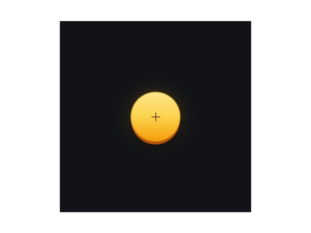
A round icon button with layered CSS glass, gradient, or dashed-frame styling and play/plus/mail presets for landing pages and toolbars.
Built with React and Tailwind. Copy the prompt and paste it into Claude Code, Cursor or Lovable: your agent adds Circle Buttons to your project and fits it to your theme.
Code
How Circle Buttons is used: the demo's code. The component's own source comes with a free account.
Usage.tsx
import { CircleButtons } from "@/components/ui/circle-buttons";

export default function CircleButtonsPlusDemo() {
  return (
    <div className="shader-frame">
      <CircleButtons
        variant="plus"
        mode="dark"
        hue={0}
        saturation={1.0}
        brightness={1.0}
      />
    </div>
  );
}
More by Meng To
View all
Gateway Flow
1.8K
Glassmorphism CTA
812
Globe Type Study
759
Particle Drift
688
Generative Tree
605
Topo Field
558
Dot Border Button
505
Spark Badge
470
More in Buttons
View all
Button Save
46

Button
20

Eclipse Button
5

Button
32

Button
6

Button
14

Button Group
37
Split Button
32

