
About
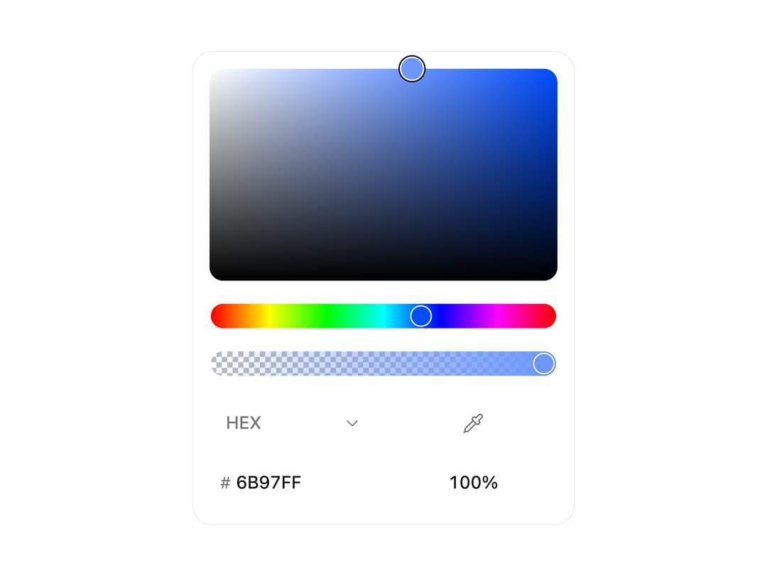
A color picker panel with HEX, RGB, HSL and OKLCH format switching, an alpha channel, optional preset swatches, and native eyedropper support, usable inline or inside a popover trigger.
Built with React and Tailwind. Copy the prompt and paste it into Claude Code, Cursor or Lovable: your agent adds Color Picker to your project and fits it to your theme.
Code
How Color Picker is used: the demo's code. The component's own source comes with a free account.
Usage.tsx
import ColorPicker from "@/components/ui/color-picker";

export default function ColorPickerDemo() {
  return (
    <div className="flex items-center justify-center w-full h-screen bg-background text-foreground p-8">
      <ColorPicker defaultValue="#6B97FF" />
    </div>
  );
}
Dependencies
More by micka_design
View all

Switch
87
Select
84
Checkbox Group
77
Table
38
Accordion
38
Segmented Tabs
37
Slider
24
Tabs Subtle
22