
About
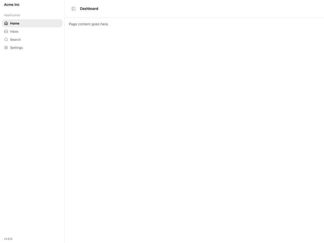
A collapsible, resizable app-shell sidebar with a mobile drawer, cookie-persisted expand/collapse state, a keyboard shortcut, floating/inset layout variants, and animated menus with a traveling hover/active/focus highlight.
Built with React and Tailwind. Copy the prompt and paste it into Claude Code, Cursor or Lovable: your agent adds Sidebar to your project and fits it to your theme.
Code
How Sidebar is used: the demo's code. The component's own source comes with a free account.
Usage.tsx
"use client";

import {
  Sidebar,
  SidebarContent,
  SidebarFooter,
  SidebarGroup,
  SidebarGroupContent,
  SidebarGroupLabel,
  SidebarHeader,
  SidebarInset,
  SidebarMenu,
  SidebarMenuButton,
  SidebarMenuItem,
  SidebarProvider,
  SidebarTrigger,
} from "@/components/ui/sidebar";
import { Home, Inbox, Search, Settings } from "lucide-react";

const items = [
  { title: "Home", icon: Home },
  { title: "Inbox", icon: Inbox },
  { title: "Search", icon: Search },
  { title: "Settings", icon: Settings },
];

export default function SidebarDemo() {
  return (
    <SidebarProvider>
      <Sidebar>
        <SidebarHeader>
          <span className="px-2 text-sm font-medium">Acme Inc</span>
        </SidebarHeader>
        <SidebarContent>
          <SidebarGroup>
            <SidebarGroupLabel>Application</SidebarGroupLabel>
            <SidebarGroupContent>
              <SidebarMenu>
                {items.map((item, index) => (
                  <SidebarMenuItem key={item.title}>
                    <SidebarMenuButton icon={item.icon} isActive={index === 0}>
                      {item.title}
                    </SidebarMenuButton>
                  </SidebarMenuItem>
                ))}
              </SidebarMenu>
            </SidebarGroupContent>
          </SidebarGroup>
        </SidebarContent>
        <SidebarFooter>
          <span className="px-2 text-xs text-muted-foreground">v1.0.0</span>
        </SidebarFooter>
      </Sidebar>
      <SidebarInset>
        <div className="flex items-center gap-2 border-b border-border p-4">
          <SidebarTrigger />
          <span className="text-sm font-medium">Dashboard</span>
        </div>
        <div className="p-4 text-sm text-muted-foreground">
          Page content goes here.
        </div>
      </SidebarInset>
    </SidebarProvider>
  );
}
Dependencies
More by micka_design
View all

Switch
87
Select
84
Checkbox Group
77
Table
38
Accordion
38
Segmented Tabs
37
Slider
24
Tabs Subtle
22
More in Navigation
View all

Sidebar
234
Navbar with Theme Toggle
43

Sidebar
339

Tabs
60
Numberless Pagination with Text
11
Oversized 404 Numeral
50
Footer
446
Pagination
43


