
About
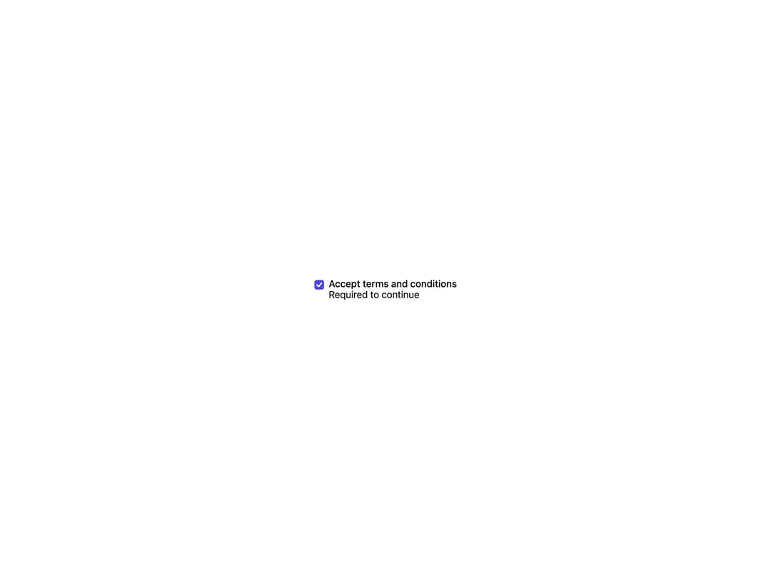
A labeled checkbox built on Radix UI's primitive with correct checked/unchecked/indeterminate semantics, optional label and helper description text.
Built with React and Tailwind. Copy the prompt and paste it into Claude Code, Cursor or Lovable: your agent adds Checkbox to your project and fits it to your theme.
Code
How Checkbox is used: the demo's code. The component's own source comes with a free account.
Usage.tsx
import { Checkbox } from "@/components/ui/checkbox";

export default function CheckboxDemo() {
  return (
    <div className="flex min-h-[200px] w-full items-center justify-center bg-background p-8">
      <Checkbox
        label="Accept terms and conditions"
        description="Required to continue"
      />
    </div>
  );
}
Dependencies
More by mohammed-saif-ibrahim
View all
Select
Filter Builder
File Upload
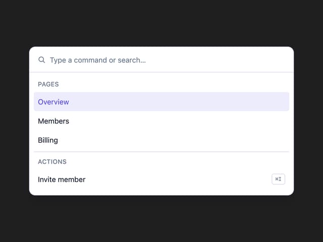
Command Palette

Activity Feed
More in Forms
View all

Premium Auth
500

Login 1
52

Book A Demo 3
83
Authentication Card
47
Book A Demo 1
69

Contact Card
1K

Login Card
32

Login 2
7
