
About
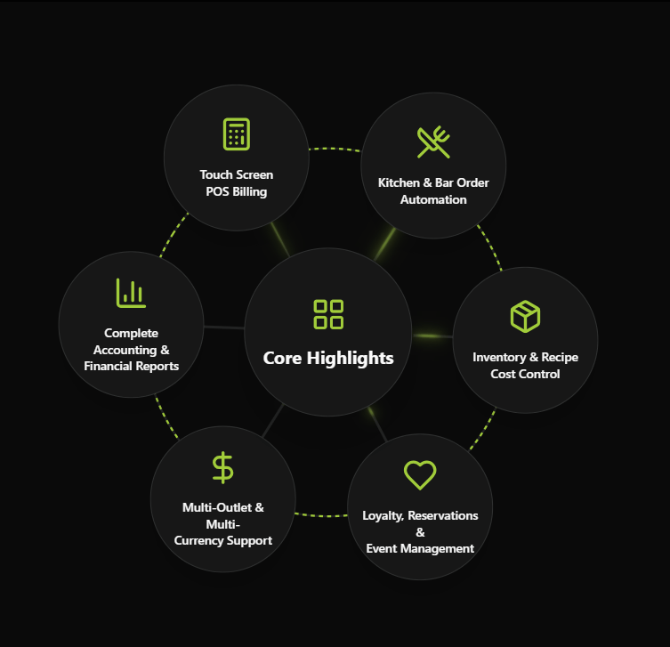
An animated orbital feature showcase: feature bubbles rotate around a central hub, connected by a dashed ring with electric pulses along the connectors. Click the center to collapse or expand the bubbles. Good for hero sections and product highlights. The number of features, the
Built with React and Tailwind. Copy the prompt and paste it into Claude Code, Cursor or Lovable: your agent adds Orbit Features to your project and fits it to your theme.
Code
How Orbit Features is used: the demo's code. The component's own source comes with a free account.
Usage.tsx
import {
  BarChart3,
  DollarSign,
  Heart,
  Package,
  Calculator,
  UtensilsCrossed,
} from "lucide-react";
import { OrbitFeatures } from "@/components/ui/orbit-features";

const settings = {
  title: "Core Highlights",
  accentColor: "#A1CC3A",
  rotationDuration: 60,
  pulseInterval: 5000,
  defaultExpanded: true,
};

const features = [
  { icon: Calculator, label: "Touch Screen\nPOS Billing" },
  { icon: UtensilsCrossed, label: "Kitchen & Bar Order\nAutomation" },
  { icon: Package, label: "Inventory & Recipe\nCost Control" },
  { icon: Heart, label: "Loyalty, Reservations &\nEvent Management" },
  { icon: DollarSign, label: "Multi-Outlet & Multi-\nCurrency Support" },
  { icon: BarChart3, label: "Complete Accounting &\nFinancial Reports" },
];

export default function DemoOne(props: Partial<typeof settings>) {
  const s = { ...settings, ...props };
  return (
    <div className="flex min-h-svh w-full items-center justify-center overflow-hidden bg-background p-6">
      <OrbitFeatures features={features} {...s} />
    </div>
  );
}
Dependencies
More in Heroes
View all

SaaS Template
2.4K

Responsive Hero Banner
2K

Hero
1.2K
Centered Hero with Image Fan
932
Editorial Collage Hero
431
Glass Fold
213

Minimalist Hero Fashion
285

HeroSectionWithGradient
336
