
About
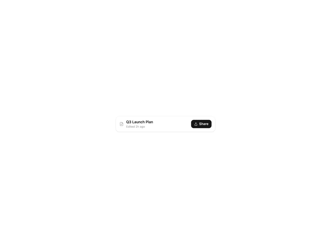
A share dialog popover that lets people invite collaborators, change a person's access role, and adjust link-sharing scope inside one floating panel that morphs between views.
Built with React and Tailwind. Copy the prompt and paste it into Claude Code, Cursor or Lovable: your agent adds Share Permissions Popover to your project and fits it to your theme.
Code
How Share Permissions Popover is used: the demo's code. The component's own source comes with a free account.
Usage.tsx
"use client";

import SharePopover from "@/components/ui/share-permissions-popover";

export default function SharePopoverDemo() {
  return (
    <div className="flex items-center justify-center w-full min-h-[24rem] bg-background p-10">
      <SharePopover />
    </div>
  );
}
Dependencies
More by Moumen Soliman
View all
Interactive Logs Table
1.4K
Glass Blog Card
1.1K
Glowy Waves Hero
921
Gallery Grid with Lightbox
790
Expanding Search Dock
762
Glassmorphism Portfolio
653
Hero Section
605
Glass Checkout Card
483