
About
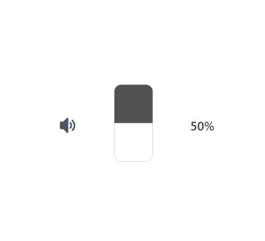
A sleek vertical volume control component featuring a rotated range slider with smooth visual feedback. Includes an interactive volume icon that toggles between normal and muted states, automatically remembering the previous volume level. Perfect for media players, audio applications, or any interface requiring intuitive volume control with a modern vertical design.
Built with React and Tailwind. Copy the prompt and paste it into Claude Code, Cursor or Lovable: your agent adds Vertical Volume Slider with Mute Toggle to your project and fits it to your theme.
Code
How Vertical Volume Slider with Mute Toggle is used: the demo's code. The component's own source comes with a free account.
Usage.tsx
import Component from "@/components/ui/vertical-volume-slider-with-mute-toggle";

export default function DemoOne() {
  return <Component />;
}
More by M.bin Salman
View all

Ethereal Beams Hero
1.1K
Rainbow Borders Button
462
Waitlist Landing Page with Countdown Timer
335
Shiny Button
329
Shiny Borders Button
317
Stardust Button
274
Shiny Button
266
Boxy App Icons
158