About
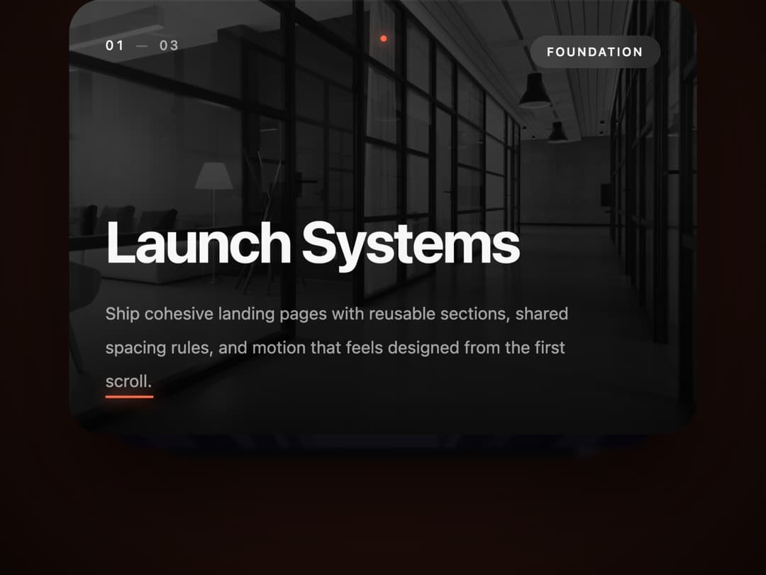
A scroll-linked 3D stacked card carousel with depth, ambient glow, progress dots, and cursor parallax for cinematic feature or story sections.
Built with React and Tailwind. Copy the prompt and paste it into Claude Code, Cursor or Lovable: your agent adds Cinematic Card Deck to your project and fits it to your theme.
Code
How Cinematic Card Deck is used: the demo's code. The component's own source comes with a free account.
Usage.tsx
"use client";

import CinematicCardDeck from "@/components/ui/cinematic-card-deck";

const cards = [
  {
    title: "Launch Systems",
    description:
      "Ship cohesive landing pages with reusable sections, shared spacing rules, and motion that feels designed from the first scroll.",
    tag: "Foundation",
    cardColor: "#0A0A0A",
    accentColor: "#FF6B4A",
    imageUrl:
      "https://cdn.21st.dev/assets/mirror/9c/9c7fd225e3bb29cb152f1073e3918dcd4ab36549fe6c2eb511d457fdbfedf3b4.jpg",
  },
  {
    title: "Motion Stories",
    description:
      "Layer cards, depth, and scroll-linked perspective to turn feature explanations into a cinematic product narrative.",
    tag: "Animation",
    cardColor: "#1A1235",
    accentColor: "#A78BFF",
    imageUrl:
      "https://cdn.21st.dev/assets/mirror/f9/f9d864aac8439bc75027dfc30d04641333df06f90ebf03b23f8ab2df77a682f9.jpg",
  },
  {
    title: "Fast Interfaces",
    description:
      "GPU-friendly transforms keep the deck smooth while content stays readable, responsive, and ready for production pages.",
    tag: "Engineering",
    cardColor: "#0C2340",
    accentColor: "#4ADBFF",
    imageUrl:
      "https://cdn.21st.dev/assets/mirror/f9/f96e460cd7bdf82317739647f551e5fed4416d0ebdc20dbf3f1fba91b9f1c6d8.jpg",
  },
];

export default function CinematicCardDeckDemo() {
  return (
    <CinematicCardDeck
      cards={cards}
      intensity="cinematic"
      sectionHeight={360}
      cardWidth={520}
      cardHeight={360}
    />
  );
}
Dependencies
More by nexus-ui
View all
Circular Carousel
1.2K
Images Badge
965
Chat Messages
302
Shooting Stars Grid
156
Infinite Moving Cards
148
Cinematic Logo Cloud
145
Logo Clouds
103
Interactive Starfield Hero
86