

About
A centered, bordered CTA card on a muted panel with a heading, subtext, and primary and outline action buttons for marketing pages.
Built with React and Tailwind. Copy the prompt and paste it into Claude Code, Cursor or Lovable: your agent adds Call to Action Card to your project and fits it to your theme.
Code
How Call to Action Card is used: the demo's code. The component's own source comes with a free account.
Usage.tsx
import CtaBlock from "@/components/ui/cta-2";

export default function Default() {
  return <CtaBlock />;
}
Dependencies
More by Oliver
View all
Dismissible Alert Stack
338
Us vs Them Comparison
334
Feature Comparison Table
237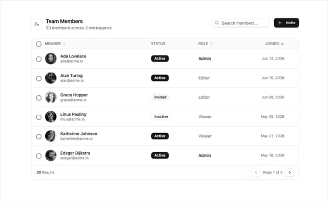
Team Members Data Table
210
How It Works Timeline
198
Logo Cloud Marquee
96
Alternating Rows With Stats
80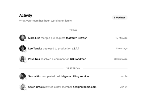
Activity Timeline
69
More in Heroes
View all

SaaS Template
2.4K

Responsive Hero Banner
2K

Hero
1.2K
Centered Hero with Image Fan
932
Editorial Collage Hero
431
Glass Fold
212

HeroSectionWithGradient
336

Aero Hero-3
559
