
About
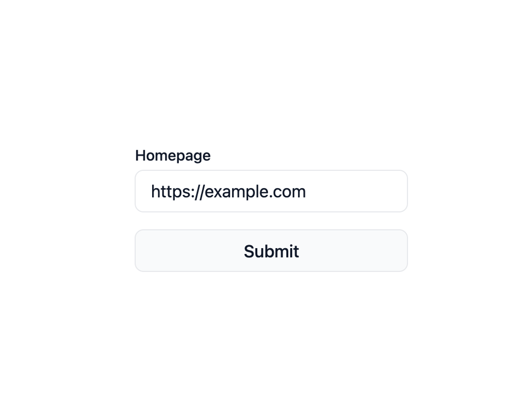
Here is Input component
Built with React and Tailwind. Copy the prompt and paste it into Claude Code, Cursor or Lovable: your agent adds Input to your project and fits it to your theme.
Code
How Input is used: the demo's code. The component's own source comes with a free account.
Usage.tsx
import * as React from 'react';
import { Field } from '@base-ui-components/react/field';
import { Form } from '@base-ui-components/react/form';

export default function ExampleForm() {
  const [errors, setErrors] = React.useState({});
  const [loading, setLoading] = React.useState(false);

  return (
    <Form
      className="flex w-full max-w-64 flex-col gap-4"
      errors={errors}
      onClearErrors={setErrors}
      onSubmit={async (event) => {
        event.preventDefault();
        const formData = new FormData(event.currentTarget);
        const value = formData.get('url') as string;

        setLoading(true);
        const response = await submitForm(value);
        const serverErrors = {
          url: response.error,
        };

        setErrors(serverErrors);
        setLoading(false);
      }}
    >
      <Field.Root name="url" className="flex flex-col items-start gap-1">
        <Field.Label className="text-sm font-medium text-gray-900">
          Homepage
        </Field.Label>
        <Field.Control
          type="url"
          required
          defaultValue="https://example.com"
          placeholder="https://example.com"
          pattern="https?://.*"
          className="h-10 w-full rounded-md border border-gray-200 pl-3.5 text-base text-gray-900 focus:outline focus:outline-2 focus:-outline-offset-1 focus:outline-blue-800"
        />
        <Field.Error className="text-sm text-red-800" />
      </Field.Root>
      <button
        disabled={loading}
        type="submit"
        className="flex h-10 items-center justify-center rounded-md border border-gray-200 bg-gray-50 px-3.5 text-base font-medium text-gray-900 select-none hover:bg-gray-100 focus-visible:outline focus-visible:outline-2 focus-visible:-outline-offset-1 focus-visible:outline-blue-800 active:bg-gray-100 disabled:cursor-not-allowed disabled:bg-gray-100 disabled:text-gray-400"
      >
        Submit
      </button>
    </Form>
  );
}

async function submitForm(value: string) {
  // Mimic a server response
  await new Promise((resolve) => {
    setTimeout(resolve, 1000);
  });

  try {
    const url = new URL(value);

    if (url.hostname.endsWith('example.com')) {
      return { error: 'The example domain is not allowed' };
    }
  } catch {
    return { error: 'This is not a valid URL' };
  }

  return { success: true };
}
Dependencies
More by MUI
View all
Toast
41
Preview Card
40
Scroll Area
34
Select
29
Number Field
27
Popover
24
Accordion
23
Navigation Menu
15

More in Forms
View all

Premium Auth
495
Authentication Card
44

Login 1
52

Login 2
7

Form
32

Card Studio
41

Form
136

Login Card
32
