About
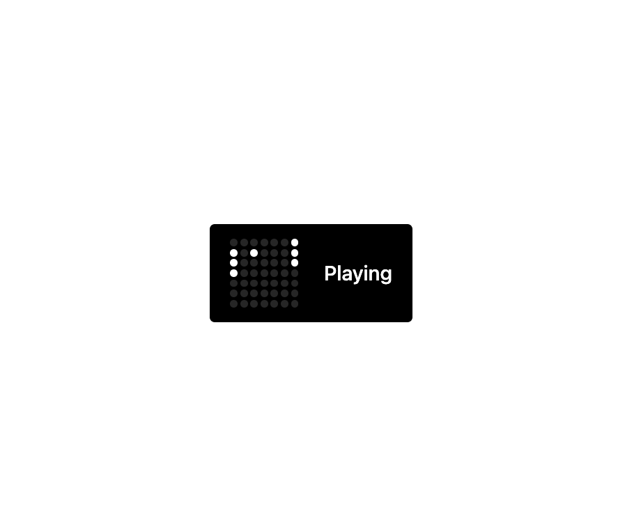
Here is Dot Loader component
Built with React and Tailwind. Copy the prompt and paste it into Claude Code, Cursor or Lovable: your agent adds Dot Loader to your project and fits it to your theme.
Code
How Dot Loader is used: the demo's code. The component's own source comes with a free account.
Usage.tsx
import { DotLoader } from "@/components/ui/dot-loader";

const game = [
    [14, 7, 0, 8, 6, 13, 20],
    [14, 7, 13, 20, 16, 27, 21],
    [14, 20, 27, 21, 34, 24, 28],
    [27, 21, 34, 28, 41, 32, 35],
    [34, 28, 41, 35, 48, 40, 42],
    [34, 28, 41, 35, 48, 42, 46],
    [34, 28, 41, 35, 48, 42, 38],
    [34, 28, 41, 35, 48, 30, 21],
    [34, 28, 41, 48, 21, 22, 14],
    [34, 28, 41, 21, 14, 16, 27],
    [34, 28, 21, 14, 10, 20, 27],
    [28, 21, 14, 4, 13, 20, 27],
    [28, 21, 14, 12, 6, 13, 20],
    [28, 21, 14, 6, 13, 20, 11],
    [28, 21, 14, 6, 13, 20, 10],
    [14, 6, 13, 20, 9, 7, 21],
];

export const Demo = () => {
    return (
        <div className="flex items-center gap-5 rounded bg-black px-4 py-3 text-white">
            <div className="">
                <DotLoader
                    frames={game}
                    className="gap-0.5"
                    dotClassName="bg-white/15 [&.active]:bg-white size-1.5"></DotLoader>
            </div>
            <p className="font-medium">Playing</p>
        </div>
    );
};

export default Demo; More by Pace UI
View all

Flip Reveal
636
Dot Flow
258
Draw Line Text
103
Liquid Glass
54
Liquid Cursor
41
Layered Stack
33
Reveal Text
6
Form Textarea
4