
About
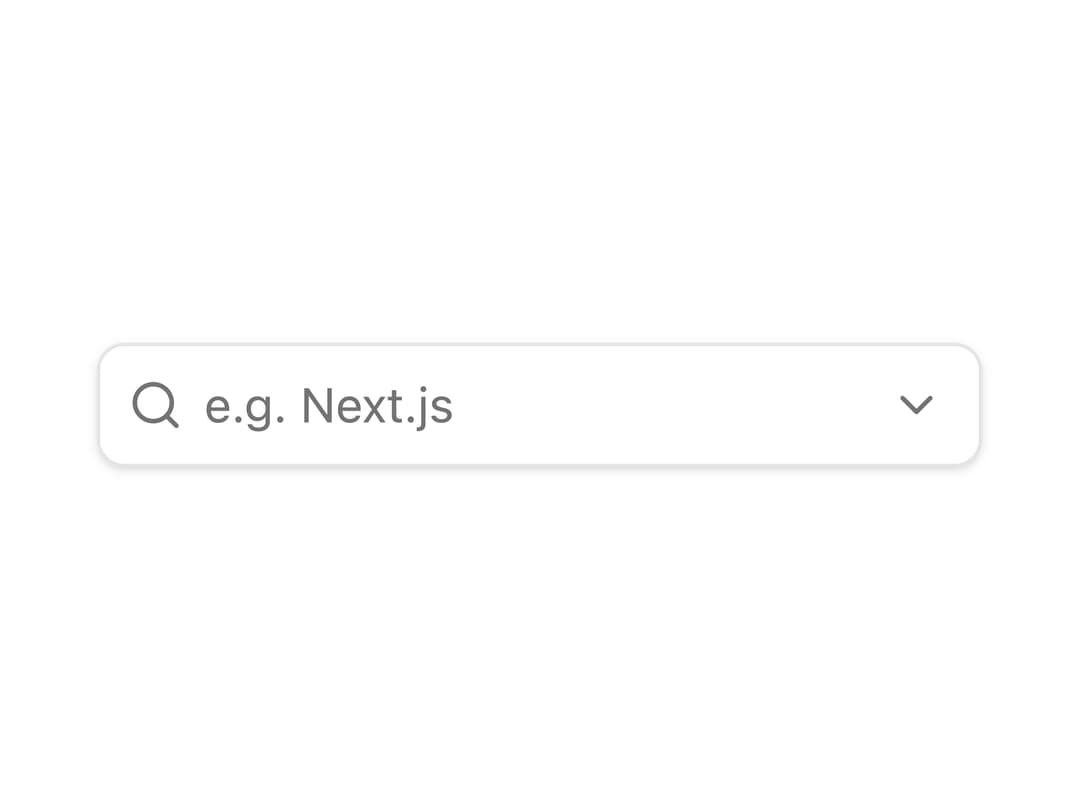
A text input that filters and suggests matching options from a list as the user types, with keyboard navigation and selection.
Built with React and Tailwind. Copy the prompt and paste it into Claude Code, Cursor or Lovable: your agent adds Autocomplete to your project and fits it to your theme.
Code
How Autocomplete is used: the demo's code. The component's own source comes with a free account.
Usage.tsx
"use client";

import {
  Autocomplete,
  AutocompleteContent,
  AutocompleteEmpty,
  AutocompleteInputGroupContent,
  AutocompleteItem,
  AutocompleteList,
} from "@/components/ui/autocomplete";
import { SearchIcon } from "lucide-react";

function AutocompleteDemo() {
  return (
    <div className="flex w-full items-center justify-center p-10">
      <Autocomplete items={tags}>
        <AutocompleteInputGroupContent
          addonIcon={<SearchIcon />}
          aria-label="Search framework"
          className="w-64"
          placeholder="e.g. Next.js"
          showClear
          showTrigger
        />

        <AutocompleteContent sideOffset={12}>
          <AutocompleteEmpty>No tags found.</AutocompleteEmpty>
          <AutocompleteList>
            {(tag: Tag) => (
              <AutocompleteItem key={tag.id} value={tag}>
                {tag.value}
              </AutocompleteItem>
            )}
          </AutocompleteList>
        </AutocompleteContent>
      </Autocomplete>
    </div>
  );
}

interface Tag {
  id: string;
  value: string;
}

const tags: Tag[] = [
  { id: "next-js", value: "Next.js" },
  { id: "react", value: "React" },
  { id: "vue", value: "Vue" },
  { id: "svelte", value: "Svelte" },
  { id: "svelteKit", value: "SvelteKit" },
  { id: "angular", value: "Angular" },
  { id: "solid", value: "Solid" },
  { id: "qwik", value: "Qwik" },
  { id: "remix", value: "Remix" },
];

export default AutocompleteDemo;
Dependencies
More by Patrick Xin
View all
Onboarding Dialog
794
Vercel Notification Popover
156
Morphing Dialog
109
Expandable Dialog
7
Unsplash Gallery Dialog
2
Team Management Dialog
Collapsible File Tree
More in Forms
View all

Premium Auth
500

Login 2
7
Authentication Card
47

Login 1
52

Contact Card
1K
Login Form
6

Form
16

Book A Demo 3
83
