
About
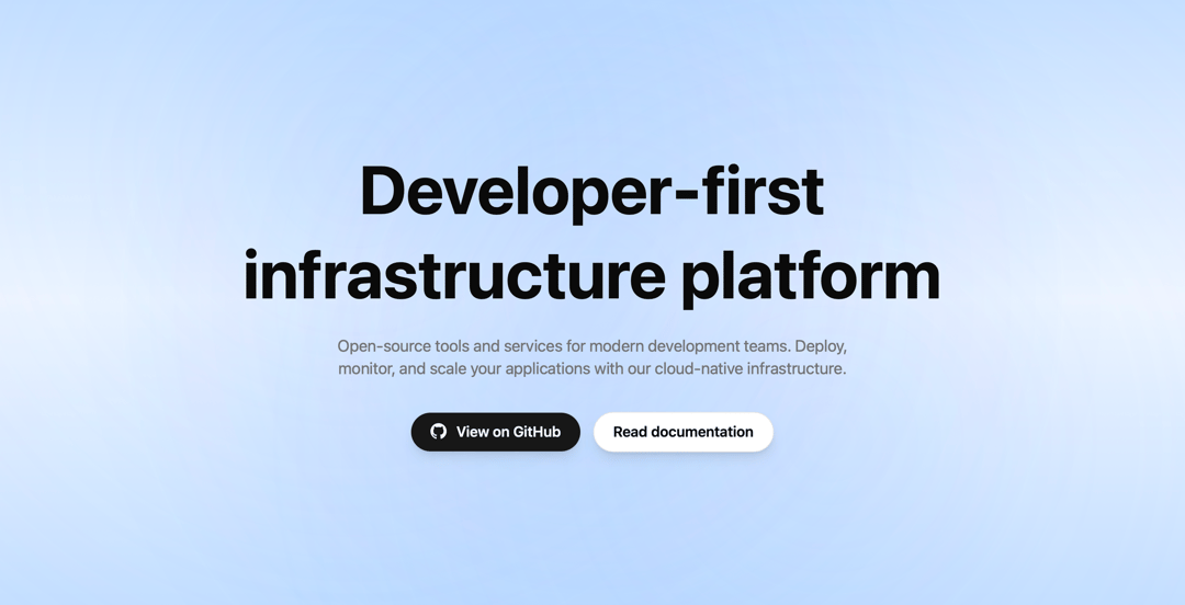
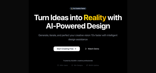
Minimal hero with headline, subtext, and two action buttons on a soft gradient background.
Built with React and Tailwind. Copy the prompt and paste it into Claude Code, Cursor or Lovable: your agent adds Hero Section to your project and fits it to your theme.
Code
How Hero Section is used: the demo's code. The component's own source comes with a free account.
Usage.tsx
import { Component } from "@/components/ui/hero-section-4"

export default function Demo() {
  return (
    <div className="w-full h-screen">
      <Component
        title="Developer-first infrastructure platform"
        description="Open-source tools and services for modern development teams. Deploy, monitor, and scale your applications with our cloud-native infrastructure."
        primaryButtonText="View on GitHub"
        primaryButtonHref="https://21st.dev/pieetie"
        secondaryButtonText="Read documentation"
        secondaryButtonHref="https://21st.dev/pieetie"
      />
    </div>
  )
}More by Pierre NATIEZ
View all

Hero Section
4
Hero Section

Hero Section
Hero Section
Hero Section
More in Heroes
View all

SaaS Template
2.4K

Responsive Hero Banner
2K

Hero
1.2K
Centered Hero with Image Fan
932
Editorial Collage Hero
431
Glass Fold
213

HeroSectionWithGradient
336

Minimalist Hero Fashion
285
