About
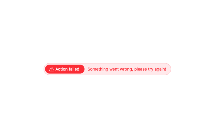
Here is Badge Tag
Built with React and Tailwind. Copy the prompt and paste it into Claude Code, Cursor or Lovable: your agent adds Badge Tag to your project and fits it to your theme.
Code
How Badge Tag is used: the demo's code. The component's own source comes with a free account.
Usage.tsx
"use client";

import React from "react";

export default function Example() {
    return (
        <div className="flex items-center space-x-2.5 border border-red-500/30 rounded-full bg-red-500/10 p-1 text-sm text-red-500">
            <div className="flex items-center space-x-1 bg-red-500 text-white border border-red-500/30 rounded-2xl px-3 py-1">
                <svg width="18" height="16" viewBox="0 0 20 18" fill="none" xmlns="http://www.w3.org/2000/svg">
                    <path d="M10 6.5v3.334m0 3.333h.008M8.575 2.217 1.516 14a1.666 1.666 0 0 0 1.425 2.5h14.117a1.667 1.667 0 0 0 1.425-2.5L11.425 2.217a1.667 1.667 0 0 0-2.85 0" stroke="#fff" strokeWidth="1.2" strokeLinecap="round" strokeLinejoin="round"/>
                </svg>
                <p>Action failed!</p>
            </div>
            <p className="pr-3">Something went wrong, please try again!</p>
        </div>
    );
};More by prebuiltui
View all

Image Gallery
1.3K
Hero Section
412
Feature Sections
344
Testimonial
303
Cards
231
FAQ Sections
177
Form
136
Login Form
125