About
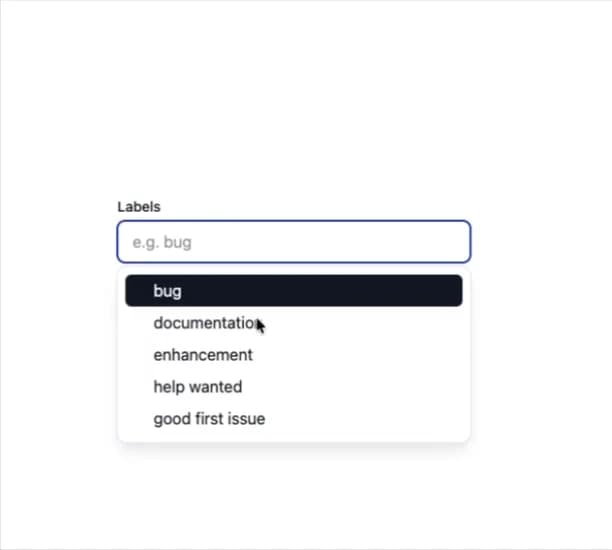
Here is Combobox component
Built with React and Tailwind. Copy the prompt and paste it into Claude Code, Cursor or Lovable: your agent adds Combobox to your project and fits it to your theme.
Code
How Combobox is used: the demo's code. The component's own source comes with a free account.
Usage.tsx
import * as React from 'react';
import { Combobox } from '@base-ui-components/react/combobox';
import { Dialog } from '@base-ui-components/react/dialog';

export default function ExampleCreatableCombobox() {
  const id = React.useId();

  const [labels, setLabels] = React.useState<LabelItem[]>(initialLabels);
  const [selected, setSelected] = React.useState<LabelItem[]>([]);
  const [query, setQuery] = React.useState('');
  const [openDialog, setOpenDialog] = React.useState(false);

  const containerRef = React.useRef<HTMLDivElement | null>(null);
  const createInputRef = React.useRef<HTMLInputElement | null>(null);
  const comboboxInputRef = React.useRef<HTMLInputElement | null>(null);
  const pendingQueryRef = React.useRef('');

  function handleCreate() {
    const input = createInputRef.current || comboboxInputRef.current;
    const value = input ? input.value.trim() : '';
    if (!value) {
      return;
    }

    const normalized = value.toLocaleLowerCase();
    const baseId = normalized.replace(/\s+/g, '-');
    const existing = labels.find((l) => l.value.trim().toLocaleLowerCase() === normalized);

    if (existing) {
      setSelected((prev) => (prev.some((i) => i.id === existing.id) ? prev : [...prev, existing]));
      setOpenDialog(false);
      setQuery('');
      return;
    }

    // Ensure we don't collide with an existing id (e.g., value "docs" vs. existing id "docs")
    const existingIds = new Set(labels.map((l) => l.id));
    let uniqueId = baseId;
    if (existingIds.has(uniqueId)) {
      let i = 2;
      while (existingIds.has(`${baseId}-${i}`)) {
        i += 1;
      }
      uniqueId = `${baseId}-${i}`;
    }

    const newItem: LabelItem = { id: uniqueId, value };

    if (!selected.find((item) => item.id === newItem.id)) {
      setLabels((prev) => [...prev, newItem]);
      setSelected((prev) => [...prev, newItem]);
    }

    setOpenDialog(false);
    setQuery('');
  }

  function handleCreateSubmit(event: React.FormEvent<HTMLFormElement>) {
    event.preventDefault();
    handleCreate();
  }

  const trimmed = query.trim();
  const lowered = trimmed.toLocaleLowerCase();
  const exactExists = labels.some((l) => l.value.trim().toLocaleLowerCase() === lowered);
  // Show the creatable item alongside matches if there's no exact match
  const itemsForView: Array<LabelItem> =
    trimmed !== '' && !exactExists
      ? [...labels, { creatable: trimmed, id: `create:${lowered}`, value: `Create "${trimmed}"` }]
      : labels;

  return (
    <React.Fragment>
      <Combobox.Root
        items={itemsForView}
        multiple
        onValueChange={(next) => {
          const last = next[next.length - 1];
          if (last && last.creatable) {
            pendingQueryRef.current = last.creatable;
            setOpenDialog(true);
            return;
          }
          const clean = next.filter((i) => !i.creatable);
          setSelected(clean);
          setQuery('');
        }}
        value={selected}
        inputValue={query}
        onInputValueChange={setQuery}
        onOpenChange={(open, details) => {
          if ('key' in details.event && details.event.key === 'Enter') {
            // When pressing Enter:
            // - If the typed value exactly matches an existing item, add that item to the selected chips
            // - Otherwise, create a new item
            if (trimmed === '') {
              return;
            }

            const existing = labels.find((l) => l.value.trim().toLocaleLowerCase() === lowered);

            if (existing) {
              setSelected((prev) =>
                prev.some((i) => i.id === existing.id) ? prev : [...prev, existing],
              );
              setQuery('');
              return;
            }

            pendingQueryRef.current = trimmed;
            setOpenDialog(true);
          }
        }}
      >
        <div className="max-w-112 flex flex-col gap-1">
          <label className="text-sm leading-5 font-medium text-gray-900" htmlFor={id}>
            Labels
          </label>
          <Combobox.Chips
            className="flex flex-wrap items-center gap-0.5 rounded-md border border-gray-200 px-1.5 py-1 w-64 focus-within:outline-2 focus-within:-outline-offset-1 focus-within:outline-blue-800 min-[500px]:w-[22rem]"
            ref={containerRef}
          >
            <Combobox.Value>
              {(value: LabelItem[]) => (
                <React.Fragment>
                  {value.map((label) => (
                    <Combobox.Chip
                      key={label.id}
                      className="flex items-center gap-1 rounded-md bg-gray-100 px-1.5 py-[0.2rem] text-sm text-gray-900 outline-none cursor-default [@media(hover:hover)]:[&[data-highlighted]]:bg-blue-800 [@media(hover:hover)]:[&[data-highlighted]]:text-gray-50 focus-within:bg-blue-800 focus-within:text-gray-50"
                      aria-label={label.value}
                    >
                      {label.value}
                      <Combobox.ChipRemove
                        className="rounded-md p-1 text-inherit hover:bg-gray-200"
                        aria-label="Remove"
                      >
                        <XIcon />
                      </Combobox.ChipRemove>
                    </Combobox.Chip>
                  ))}
                  <Combobox.Input
                    ref={comboboxInputRef}
                    id={id}
                    placeholder={value.length > 0 ? '' : 'e.g. bug'}
                    className="min-w-12 flex-1 h-8 rounded-md border-0 bg-transparent pl-2 text-base text-gray-900 outline-none"
                  />
                </React.Fragment>
              )}
            </Combobox.Value>
          </Combobox.Chips>
        </div>

        <Combobox.Portal>
          <Combobox.Positioner className="z-50 outline-none" sideOffset={4} anchor={containerRef}>
            <Combobox.Popup className="w-[var(--anchor-width)] max-h-[min(var(--available-height),24rem)] max-w-[var(--available-width)] overflow-y-auto scroll-pt-2 scroll-pb-2 overscroll-contain rounded-lg bg-[canvas] py-2 text-gray-900 shadow-lg shadow-gray-200 outline-1 outline-gray-200 dark:shadow-none dark:-outline-offset-1 dark:outline-gray-300">
              <Combobox.Empty className="px-4 py-2 text-[0.925rem] leading-4 text-gray-600 empty:m-0 empty:p-0">
                No labels found.
              </Combobox.Empty>
              <Combobox.List>
                {(item: LabelItem) =>
                  item.creatable ? (
                    <Combobox.Item
                      key={item.id}
                      className="grid cursor-default grid-cols-[0.75rem_1fr] items-center gap-2 py-2 pr-8 pl-4 text-base leading-4 outline-none select-none [@media(hover:hover)]:[&[data-highlighted]]:relative [@media(hover:hover)]:[&[data-highlighted]]:z-0 [@media(hover:hover)]:[&[data-highlighted]]:text-gray-50 [@media(hover:hover)]:[&[data-highlighted]]:before:absolute [@media(hover:hover)]:[&[data-highlighted]]:before:inset-x-2 [@media(hover:hover)]:[&[data-highlighted]]:before:inset-y-0 [@media(hover:hover)]:[&[data-highlighted]]:before:z-[-1] [@media(hover:hover)]:[&[data-highlighted]]:before:rounded-sm [@media(hover:hover)]:[&[data-highlighted]]:before:bg-gray-900"
                      value={item}
                    >
                      <span className="col-start-1">
                        <PlusIcon className="size-3" />
                      </span>
                      <div className="col-start-2">Create "{item.creatable}"</div>
                    </Combobox.Item>
                  ) : (
                    <Combobox.Item
                      key={item.id}
                      className="grid cursor-default grid-cols-[0.75rem_1fr] items-center gap-2 py-2 pr-8 pl-4 text-base leading-4 outline-none select-none [@media(hover:hover)]:[&[data-highlighted]]:relative [@media(hover:hover)]:[&[data-highlighted]]:z-0 [@media(hover:hover)]:[&[data-highlighted]]:text-gray-50 [@media(hover:hover)]:[&[data-highlighted]]:before:absolute [@media(hover:hover)]:[&[data-highlighted]]:before:inset-x-2 [@media(hover:hover)]:[&[data-highlighted]]:before:inset-y-0 [@media(hover:hover)]:[&[data-highlighted]]:before:z-[-1] [@media(hover:hover)]:[&[data-highlighted]]:before:rounded-sm [@media(hover:hover)]:[&[data-highlighted]]:before:bg-gray-900"
                      value={item}
                    >
                      <Combobox.ItemIndicator className="col-start-1">
                        <CheckIcon className="size-3" />
                      </Combobox.ItemIndicator>
                      <div className="col-start-2">{item.value}</div>
                    </Combobox.Item>
                  )
                }
              </Combobox.List>
            </Combobox.Popup>
          </Combobox.Positioner>
        </Combobox.Portal>
      </Combobox.Root>

      <Dialog.Root open={openDialog} onOpenChange={setOpenDialog}>
        <Dialog.Portal>
          <Dialog.Backdrop className="fixed inset-0 bg-black opacity-20 transition-opacity dark:opacity-70 data-[starting-style]:opacity-0 data-[ending-style]:opacity-0" />
          <Dialog.Popup
            className="fixed left-1/2 top-1/2 -translate-x-1/2 -translate-y-1/2 mt-[-2rem] w-[24rem] max-w-[calc(100vw-3rem)] rounded-lg bg-[canvas] p-6 text-gray-900 outline-1 outline-gray-200 transition-all data-[starting-style]:opacity-0 data-[starting-style]:scale-90 data-[ending-style]:opacity-0 data-[ending-style]:scale-90 dark:-outline-offset-1 dark:outline-gray-300"
            initialFocus={createInputRef}
          >
            <Dialog.Title className="-mt-1.5 mb-1 text-lg leading-7 tracking-[-0.0025em] font-medium">
              Create new label
            </Dialog.Title>
            <Dialog.Description className="mb-4 text-base leading-6 text-gray-600">
              Add a new label to select.
            </Dialog.Description>
            <form onSubmit={handleCreateSubmit}>
              <input
                ref={createInputRef}
                className="w-full h-10 rounded-md border border-gray-200 bg-[canvas] text-gray-900 px-2.5 focus-visible:outline focus-visible:outline-2 focus-visible:-outline-offset-1 focus-visible:outline-blue-800"
                placeholder="Label name"
                defaultValue={pendingQueryRef.current}
              />
              <div className="mt-4 flex justify-end gap-4">
                <Dialog.Close className="flex h-10 items-center justify-center rounded-md border border-gray-200 bg-gray-50 px-3.5 text-base font-medium text-gray-900 select-none hover:bg-gray-100 focus-visible:-outline-offset-1 focus-visible:outline-blue-800 active:bg-gray-100">
                  Cancel
                </Dialog.Close>
                <button
                  type="submit"
                  className="flex h-10 items-center justify-center rounded-md border border-gray-200 bg-gray-50 px-3.5 text-base font-medium text-gray-900 select-none hover:bg-gray-100 focus-visible:outline-2 focus-visible:-outline-offset-1 focus-visible:outline-blue-800 active:bg-gray-100"
                >
                  Create
                </button>
              </div>
            </form>
          </Dialog.Popup>
        </Dialog.Portal>
      </Dialog.Root>
    </React.Fragment>
  );
}

function CheckIcon(props: React.ComponentProps<'svg'>) {
  return (
    <svg fill="currentcolor" width="10" height="10" viewBox="0 0 10 10" {...props}>
      <path d="M9.1603 1.12218C9.50684 1.34873 9.60427 1.81354 9.37792 2.16038L5.13603 8.66012C5.01614 8.8438 4.82192 8.96576 4.60451 8.99384C4.3871 9.02194 4.1683 8.95335 4.00574 8.80615L1.24664 6.30769C0.939709 6.02975 0.916013 5.55541 1.19372 5.24822C1.47142 4.94102 1.94536 4.91731 2.2523 5.19524L4.36085 7.10461L8.12299 1.33999C8.34934 0.993152 8.81376 0.895638 9.1603 1.12218Z" />
    </svg>
  );
}

function PlusIcon(props: React.ComponentProps<'svg'>) {
  return (
    <svg
      width="12"
      height="12"
      viewBox="0 0 12 12"
      fill="none"
      stroke="currentColor"
      strokeWidth="1.5"
      strokeLinecap="butt"
      strokeLinejoin="miter"
      aria-hidden
      {...props}
    >
      <path d="M6 1v10M1 6h10" />
    </svg>
  );
}

function XIcon(props: React.ComponentProps<'svg'>) {
  return (
    <svg
      xmlns="http://www.w3.org/2000/svg"
      width={16}
      height={16}
      viewBox="0 0 24 24"
      fill="none"
      stroke="currentColor"
      strokeWidth="2"
      strokeLinecap="round"
      strokeLinejoin="round"
      aria-hidden
      {...props}
    >
      <path d="M18 6 6 18" />
      <path d="m6 6 12 12" />
    </svg>
  );
}

interface LabelItem {
  creatable?: string;
  id: string;
  value: string;
}

const initialLabels: LabelItem[] = [
  { id: 'bug', value: 'bug' },
  { id: 'docs', value: 'documentation' },
  { id: 'enhancement', value: 'enhancement' },
  { id: 'help-wanted', value: 'help wanted' },
  { id: 'good-first-issue', value: 'good first issue' },
];
Dependencies
More by prebuiltui
View all

Image Gallery
1.3K
Hero Section
412
Feature Sections
344
Testimonial
298
Cards
231
FAQ Sections
177
Form
136
Login Form
125
More in Forms
View all

Premium Auth
496
Authentication Card
45

Login 1
52

Login 2
7

Form
32

Card Studio
41

Login Card
32

Book A Demo 1
68
