
About
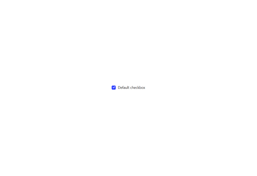
A customizable checkbox component with smooth animations and multiple states.
Built with React and Tailwind. Copy the prompt and paste it into Claude Code, Cursor or Lovable: your agent adds Checkbox to your project and fits it to your theme.
Code
How Checkbox is used: the demo's code. The component's own source comes with a free account.
Usage.tsx
import { Checkbox } from "@/components/ui/checkbox";


export default function DemoOne() {
  return (
    <>
      <Checkbox className="font-medium" label="Default checkbox" />
    </>
  );
}
Dependencies
More by Preet Suthar
View all

Modern & Stunning sign in
1.6K
Shining Text
1.5K
Magic Text
845
Toolbar
822
Hero 2
818
Typewriter Text
769
AI Chat Input
734
Full Screen Signup
731
More in Forms
View all

Premium Auth
500

Login 2
7
Authentication Card
47

Login 1
52

Contact Card
1K
Login Form
6

Form
16

Book A Demo 3
83
