
About
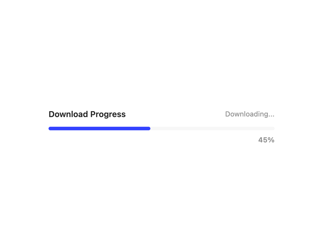
A versatile progress component for displaying completion status, loading states, and step-by-step processes.
Built with React and Tailwind. Copy the prompt and paste it into Claude Code, Cursor or Lovable: your agent adds Progress to your project and fits it to your theme.
Code
How Progress is used: the demo's code. The component's own source comes with a free account.
Usage.tsx
import { Progress } from "@/components/ui/progress";

export default function DemoOne() {
  return(
    <>
        <div className="space-y-3 max-w-sm w-full mx-auto">
          <div className="flex items-center justify-between">
            <span className="text-sm font-semibold">Download Progress</span>
            <span className="text-xs text-muted-foreground ">Downloading...</span>
          </div>
          <Progress value={45} showValue className="w-full" size="sm" />
        </div>
    </>
  );
}
Dependencies
More by Preet Suthar
View all

Modern & Stunning sign in
1.6K
Shining Text
1.5K
Magic Text
845
Toolbar
821
Hero 2
818
Typewriter Text
768
AI Chat Input
733
Full Screen Signup
729