About
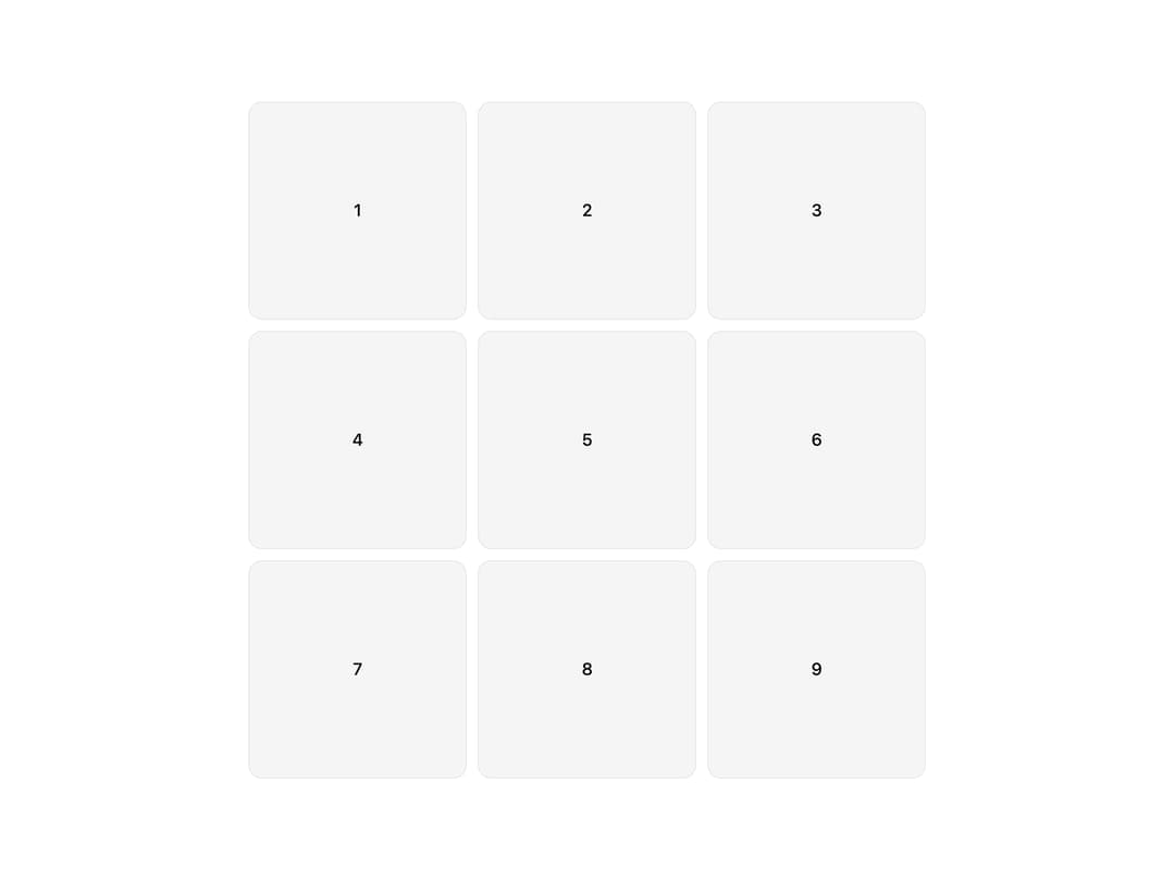
Grid that reveals its items with a wave-like stagger animation on scroll, with configurable columns and timing.
Built with React and Tailwind. Copy the prompt and paste it into Claude Code, Cursor or Lovable: your agent adds Stagger Reveal Grid to your project and fits it to your theme.
Code
How Stagger Reveal Grid is used: the demo's code. The component's own source comes with a free account.
Usage.tsx
import { StaggerRevealGrid } from "@/components/ui/stagger-reveal-grid";

export default function Default() {
  return (
    <div className="mx-auto w-full max-w-3xl p-6">
      <StaggerRevealGrid columns={3}>
        {[1, 2, 3, 4, 5, 6, 7, 8, 9].map((n) => (
          <div
            key={n}
            className="flex aspect-square items-center justify-center rounded-xl border bg-muted/40 text-lg font-medium text-foreground"
          >
            {n}
          </div>
        ))}
      </StaggerRevealGrid>
    </div>
  );
}
Dependencies
More by pulkitxm
View all

Handwriting SVG
429
Aurora Background
151
Party Popper
50
Scroll-Linked Video Scrubber
34
Horizontal Scroll Gallery
32
Fluid Cursor Trail
32
Cursor Spotlight
29
Not Found Page
15