
About
An understated canvas for your next big idea. Source: BuildWithMe UI. Original attribution and MIT notices are included with the component.
Built with React and Tailwind. Copy the prompt and paste it into Claude Code, Cursor or Lovable: your agent adds Dot Grid to your project and fits it to your theme.
Code
How Dot Grid is used: the demo's code. The component's own source comes with a free account.
Usage.tsx
import Component from "@/components/ui/buildwithme-dot-grid";

export default function Demo() {
  return (
    <div data-bwm-theme="dark" className="flex min-h-screen w-full items-center justify-center bg-[#050505] px-6">
      <div className="w-full max-w-[760px]">
        <Component />
      </div>
    </div>
  );
}
More by purnavu-12
View all
Border-Trace Button
11
Flowing Lines
8
Streaming Message
8
Magnetic Button
2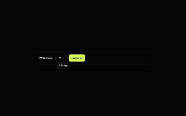
Breadcrumb Trail
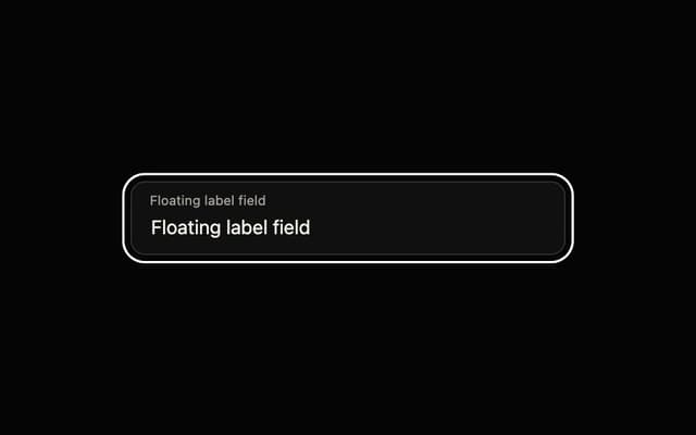
Floating Label Field
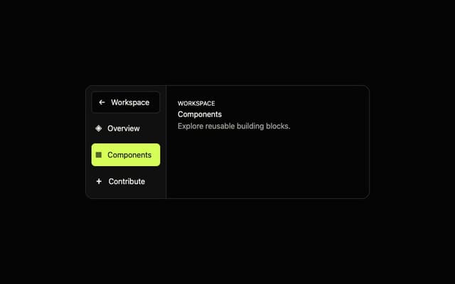
Adaptive Sidebar
More in Backgrounds
View all
Elegant Dark Pattern
811

Gradient Backgrounds
25
Jade Sky
85

LivingOrigami bg
135

Tailwind CSS Background Snippet
536
Background snippets
14
Light theme Tailwind CSS Background Snippet
221
Gradient Blur Bg
18

