
About
A compact status indicator with staggered, motion-safe dots. Source: BuildWithMe UI. Original attribution and MIT notices are included with the component.
Built with React and Tailwind. Copy the prompt and paste it into Claude Code, Cursor or Lovable: your agent adds Loading Dots to your project and fits it to your theme.
Code
How Loading Dots is used: the demo's code. The component's own source comes with a free account.
Usage.tsx
import Component from "@/components/ui/buildwithme-loading-dots";

export default function Demo() {
  return (
    <div data-bwm-theme="dark" className="flex min-h-screen w-full items-center justify-center bg-[#050505] px-6">
      <div className="w-full max-w-[760px]">
        <Component />
      </div>
    </div>
  );
}
More by purnavu-12
View all
Border-Trace Button
10
Flowing Lines
8
Streaming Message
7
Magnetic Button
2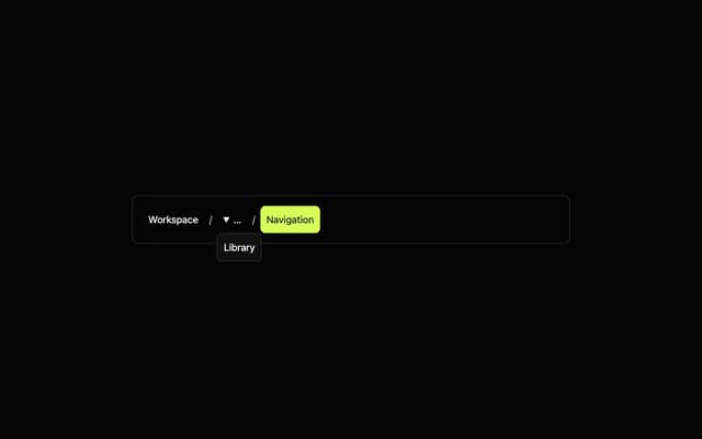
Breadcrumb Trail
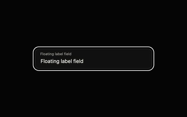
Floating Label Field
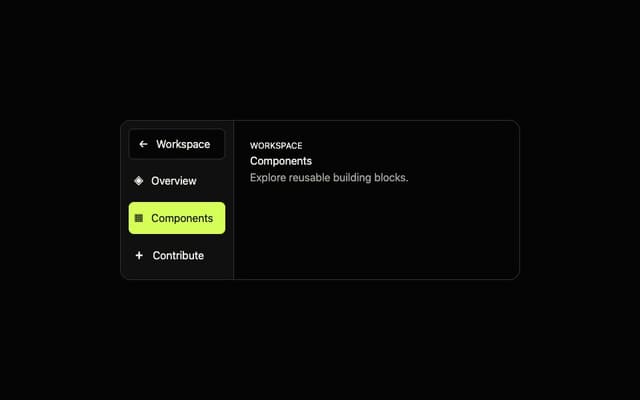
Adaptive Sidebar
More in Text
View all

Vertical Cut Reveal Characters
103

Rainbow Text Effect
47
Text Loop
306
Motion Blur Text
36
Text Reveal
26
Apple Hello Effect
608
Lightning Text
122

ParticleTextEffect
2.1K

