
About
A precise operational badge for deployment, build, and service states. Source: BuildWithMe UI. Original attribution and MIT notices are included with the component.
Built with React and Tailwind. Copy the prompt and paste it into Claude Code, Cursor or Lovable: your agent adds Status Badge to your project and fits it to your theme.
Code
How Status Badge is used: the demo's code. The component's own source comes with a free account.
Usage.tsx
import Component from "@/components/ui/buildwithme-status-badge";

export default function Demo() {
  return (
    <div data-bwm-theme="dark" className="flex min-h-screen w-full items-center justify-center bg-[#050505] px-6">
      <div className="w-full max-w-[760px]">
        <Component />
      </div>
    </div>
  );
}
More by purnavu-12
View all
Border-Trace Button
11
Flowing Lines
8
Streaming Message
8
Magnetic Button
2
Breadcrumb Trail
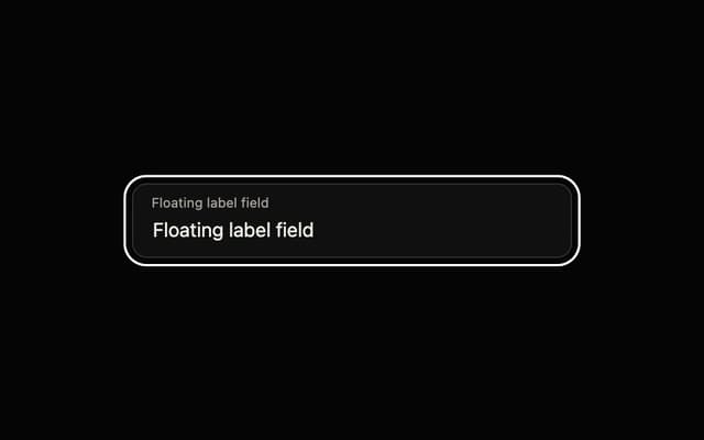
Floating Label Field
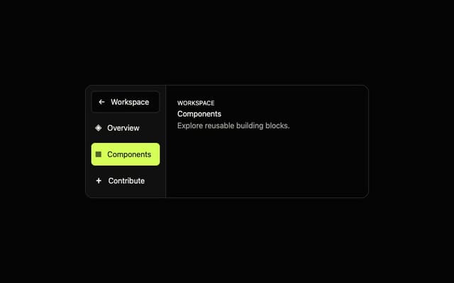
Adaptive Sidebar