
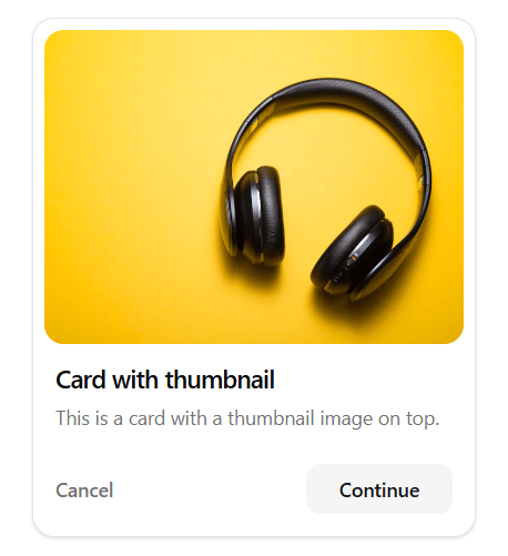
About
A modern, versatile content card featuring a prominent inset thumbnail layout. Designed for e-commerce products, blog posts, or media items. Includes a clean title, description, and a footer with "Cancel" and "Continue" actions. Built with Tailwind CSS and fully responsive. Dependencies: clsx and tailwind-merge
Built with React and Tailwind. Copy the prompt and paste it into Claude Code, Cursor or Lovable: your agent adds Card With Thumbnail to your project and fits it to your theme.
Code
How Card With Thumbnail is used: the demo's code. The component's own source comes with a free account.
Usage.tsx
import { Component } from "@/components/ui/card-with-thumbnail";

export default function DemoOne() {
  return <Component />;
}
More by Ramprasad Reddy
View all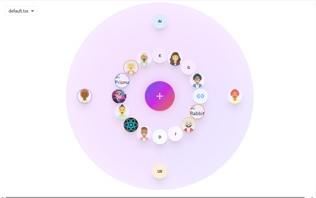
Orbiting Ecosystem

Grok Interface Kit
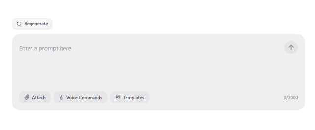
AI Prompt Input with Actions
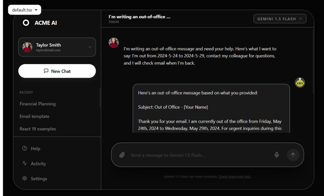
Modern AI Chat Dashboard

Prompt Input Full Line
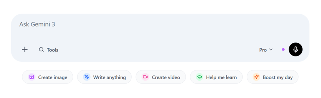
Gemini 3 Input
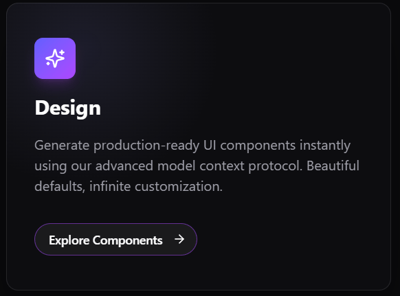
AI Feature Card
More in Buttons
View all
Button Save
46

Button
20

Eclipse Button
5

Button
6

Button
14

Button Group
37

Button
32
Split Button
32

