
About
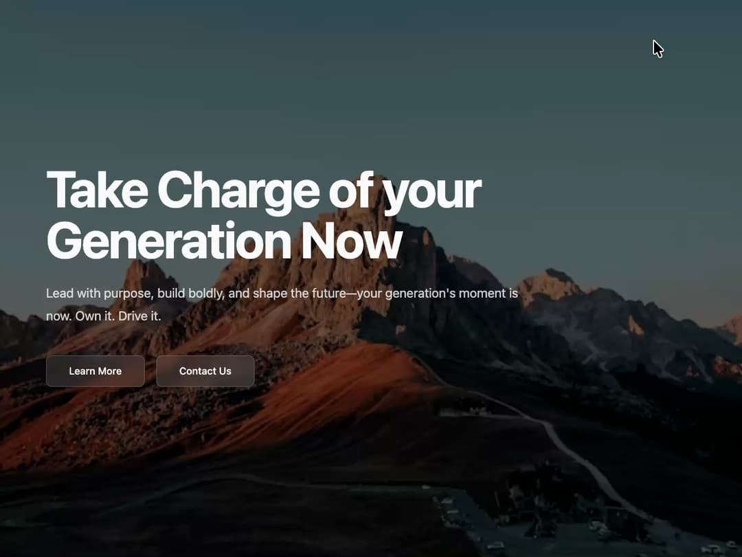
Animated Hero Section Description: A responsive, full-screen hero section with a background image and text elements that animate into view. It features a customizable navigation bar, title, description, and call-to-action buttons, making it highly reusable for various landing pages.
Built with React and Tailwind. Copy the prompt and paste it into Claude Code, Cursor or Lovable: your agent adds Animated Hero Section to your project and fits it to your theme.
Code
How Animated Hero Section is used: the demo's code. The component's own source comes with a free account.
Usage.tsx
import { AnimatedHero } from "@/components/ui/animated-hero-section-1";
import { Button } from "@/components/ui/button";
import { MountainIcon } from "lucide-react";

export default function AnimatedHeroDemo() {
  const navLinks = [
    { label: "Solutions", href: "#" },
    { label: "Working", href: "#" },
    { label: "Discover", href: "#" },
  ];

  const handleCtaClick = () => {
    alert("Primary CTA clicked!");
  };

  const handleSecondaryCtaClick = () => {
    alert("Secondary CTA clicked!");
  };

  return (
    <AnimatedHero
      backgroundImageUrl="https://cdn.21st.dev/assets/mirror/c5/c5832175f6f9db22d2918483d8cf4039ec0193385658dd908d0dc8201063b110.jpg"
      logo={
        <>
          <MountainIcon className="h-6 w-6 text-primary-foreground" />
          <span className="font-semibold text-primary-foreground">TwentyFirst</span>
        </>
      }
      navLinks={navLinks}

      // UPDATED: The top-right button now uses the same glass style for consistency
      topRightAction={
        <Button className="bg-white/10 backdrop-blur-sm border border-white/20 text-primary-foreground hover:bg-white/20">
          Get Consultation
        </Button>
      }

      title="Take Charge of your Generation Now"
      description="Lead with purpose, build boldly, and shape the future—your generation's moment is now. Own it. Drive it."

      ctaButton={{
        text: "Learn More",
        onClick: handleCtaClick,
      }}

      secondaryCta={{
        text: "Contact Us",
        onClick: handleSecondaryCtaClick,
      }}
    />
  );
}
Dependencies
More by Ravi Katiyar
View all

Animated Shader Hero
3.7K
Hero
3.1K
Circular Gallery
2.7K
Minimalist Hero
2.5K
Floating Icons Hero Section
1.9K
Glass Calendar
1.8K
Feature Carousel
1.7K
AI Image Generator Hero
1.4K
More in Heroes
View all

SaaS Template
2.4K
Centered Hero with Image Fan
930

Hero
1.2K

Responsive Hero Banner
2K

Minimalist Hero Fashion
285

Hero Section 6
881

Home Section
66
Hero Golden Spiral
101
