
About
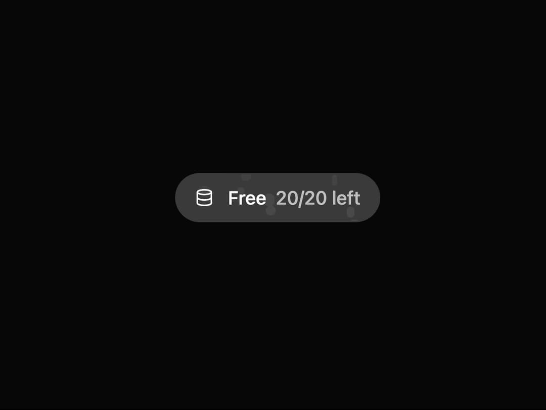
Usage badge for free plan tracking. Displays remaining quota (e.g., 20/20 left) with a database icon. Ideal for freemium apps to show user limits transparently.
Built with React and Tailwind. Copy the prompt and paste it into Claude Code, Cursor or Lovable: your agent adds Bubble Button to your project and fits it to your theme.
Code
How Bubble Button is used: the demo's code. The component's own source comes with a free account.
Usage.tsx
import { Database } from "lucide-react"; // Using lucide-react for icons
import { UsageBadge } from "@/components/ui/bubble-button"; // Adjust the import path as needed

export default function UsageBadgeDemo() {
  return (
    <div className="flex min-h-[200px] w-full items-center justify-center bg-background p-4">
      <UsageBadge
        icon={<Database className="h-4 w-4" />}
        planName="Free"
        usage={20}
        limit={20}
        tooltipContent={
          <p>
            You are on the free plan.
            <br />
            20/20 generations left.
          </p>
        }
      />
    </div>
  );
}More by Ravi Katiyar
View all

Animated Shader Hero
3.7K
Hero
3.1K
Circular Gallery
2.7K
Minimalist Hero
2.5K
Floating Icons Hero Section
1.8K
Glass Calendar
1.8K
Feature Carousel
1.7K
AI Image Generator Hero
1.4K