
About
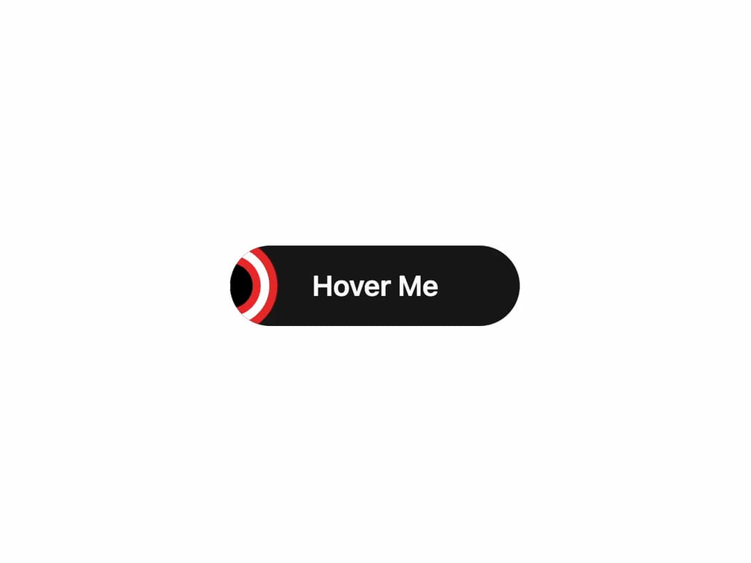
Animated Hover Button Interactive button with dynamic hover effects that grab attention instantly. Perfect for CTAs, navigation, or any action where engagement matters.
Built with React and Tailwind. Copy the prompt and paste it into Claude Code, Cursor or Lovable: your agent adds Button to your project and fits it to your theme.
Code
How Button is used: the demo's code. The component's own source comes with a free account.
Usage.tsx
import { AnimatedLayerButton } from "@/components/ui/button"; // Adjust this path as necessary

export default function AnimatedLayerButtonDemo() {
  return (
    <div className="flex min-h-[250px] w-full items-center justify-center bg-background p-10">
      <AnimatedLayerButton>
        Hover Me
      </AnimatedLayerButton>
    </div>
  );
}More by Ravi Katiyar
View all

Animated Shader Hero
3.7K
Hero
3.1K
Circular Gallery
2.7K
Minimalist Hero
2.5K
Floating Icons Hero Section
1.9K
Glass Calendar
1.8K
Feature Carousel
1.7K
AI Image Generator Hero
1.4K
More in Buttons
View all
Button Save
46

Button
20

Eclipse Button
5

Button
32

Button
6

Button
14

Button Group
37
Split Button
32

