
About
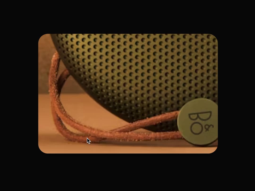
Interactive Zoom Image An image component that smoothly zooms in on the cursor's position on hover. It leverages framer-motion for fluid animations and is fully customizable through props.
Built with React and Tailwind. Copy the prompt and paste it into Claude Code, Cursor or Lovable: your agent adds Card to your project and fits it to your theme.
Code
How Card is used: the demo's code. The component's own source comes with a free account.
Usage.tsx
import { ZoomImage } from '@/components/ui/card-1'; // Adjust the import path as needed

export default function ZoomImageDemo() {
  return (
    <div className="flex items-center justify-center p-4 md:p-8 bg-background">
      <div className="w-full max-w-md">
        <ZoomImage
          src="https://cdn.21st.dev/assets/mirror/3f/3f38e1ea66e262fe195adabca0330bca2ff29a9fc2cdf84dd7f09458122e798a.jpg"
          alt="A stylish white and wooden desk chair"
          zoomScale={3.5}
          transitionDuration={0.5}
          borderRadius={24}
          className="shadow-lg"
        />
      </div>
    </div>
  );
}
Dependencies
More by Ravi Katiyar
View all

Animated Shader Hero
3.7K
Hero
3.1K
Circular Gallery
2.7K
Minimalist Hero
2.5K
Floating Icons Hero Section
1.9K
Glass Calendar
1.8K
Feature Carousel
1.7K
AI Image Generator Hero
1.4K