
About
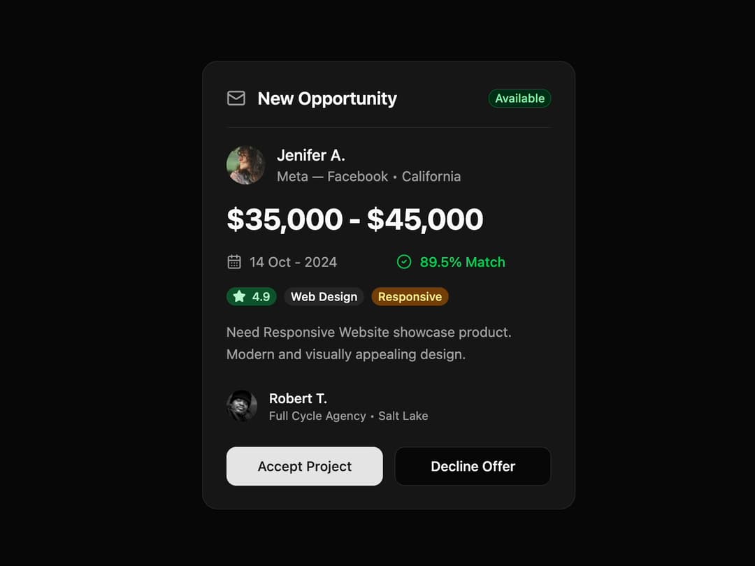
Opportunity Card A visually polished and responsive card component to display project opportunities or job offers, complete with user details, project specifications, and action buttons. It's designed to be easily populated with dynamic data.
Built with React and Tailwind. Copy the prompt and paste it into Claude Code, Cursor or Lovable: your agent adds Card to your project and fits it to your theme.
Code
How Card is used: the demo's code. The component's own source comes with a free account.
Usage.tsx
import { OpportunityCard, OpportunityCardProps } from '@/components/ui/card-12';

const Demo = () => {
  // Sample data to populate the card
  const opportunityData: Omit<OpportunityCardProps, 'onAccept' | 'onDecline'> = {
    status: 'Available',
    postedBy: {
      name: 'Jenifer A.',
      avatarUrl: 'https://cdn.21st.dev/assets/mirror/cd/cdefddb3068a0bc9ce7cbd5afaca815e5649326e72d81e5ca6f3dc34551d7bc8.jpg',
      company: 'Meta — Facebook',
      location: 'California',
    },
    salaryRange: {
      min: 35000,
      max: 45000,
    },
    deadline: '14 Oct - 2024',
    matchPercentage: 89.5,
    rating: 4.9,
    tags: ['Web Design'],
    description: 'Need Responsive Website showcase product. Modern and visually appealing design.',
    recruiter: {
      name: 'Robert T.',
      avatarUrl: 'https://cdn.21st.dev/assets/mirror/22/2227f27555cfdda5ca407e3706a473660e40a64d3e026a961f24197066e55aa2.jpg',
      company: 'Full Cycle Agency',
      location: 'Salt Lake',
    },
  };

  // Handler functions for the buttons
  const handleAccept = () => {
    console.log('Project Accepted!');
    // Add your accept logic here
  };

  const handleDecline = () => {
    console.log('Offer Declined.');
    // Add your decline logic here
  };

  return (
    <div className="flex min-h-screen items-center justify-center bg-background p-4">
      <OpportunityCard
        {...opportunityData}
        onAccept={handleAccept}
        onDecline={handleDecline}
      />
    </div>
  );
};

export default Demo;
Dependencies
More by Ravi Katiyar
View all

Animated Shader Hero
3.7K
Hero
3.1K
Circular Gallery
2.7K
Minimalist Hero
2.5K
Floating Icons Hero Section
1.9K
Glass Calendar
1.8K
Feature Carousel
1.7K
AI Image Generator Hero
1.4K
More in Buttons
View all
Button Save
46

Button
20

Eclipse Button
5

Button
6

Button
14

Button Group
37

Button
32
Split Button
32

