
About
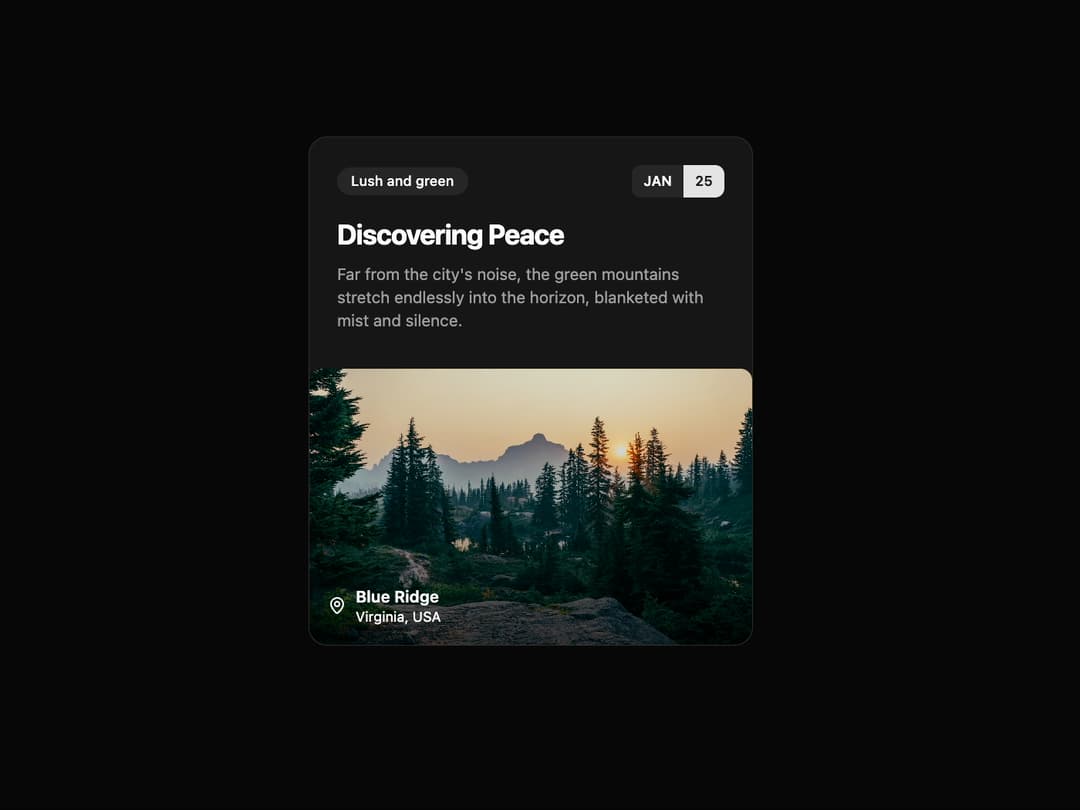
Article Card This card component is designed to showcase an article, event, or location in a visually appealing and structured format. It's fully responsive and uses shadcn/ui theme variables for seamless light/dark mode integration.
Built with React and Tailwind. Copy the prompt and paste it into Claude Code, Cursor or Lovable: your agent adds Card to your project and fits it to your theme.
Code
How Card is used: the demo's code. The component's own source comes with a free account.
Usage.tsx
import { ArticleCard, ArticleCardProps } from "@/components/ui/card-23"; // Adjust the import path

const ArticleCardDemo = () => {
  // Data for the card, passed as props for reusability
  const cardData: ArticleCardProps = {
    tag: "Lush and green",
    date: {
      month: "JAN",
      day: 25,
    },
    title: "Discovering Peace",
    description:
      "Far from the city's noise, the green mountains stretch endlessly into the horizon, blanketed with mist and silence.",
    imageUrl: "https://cdn.21st.dev/assets/mirror/36/3644b0faa191a85a583b2b63e517d97e9d231de55a9e0b5d78d8401db3577788.jpg", // A placeholder image
    imageAlt: "A lush green hill with a beautiful contour.",
    location: {
      city: "Blue Ridge",
      country: "Virginia, USA",
    },
  };

  return (
    <div className="flex min-h-screen w-full items-center justify-center bg-background p-4">
      <ArticleCard {...cardData} />
    </div>
  );
};

export default ArticleCardDemo;
Dependencies
More by Ravi Katiyar
View all

Animated Shader Hero
3.7K
Hero
3.1K
Circular Gallery
2.7K
Minimalist Hero
2.5K
Floating Icons Hero Section
1.9K
Glass Calendar
1.8K
Feature Carousel
1.7K
AI Image Generator Hero
1.4K