
About
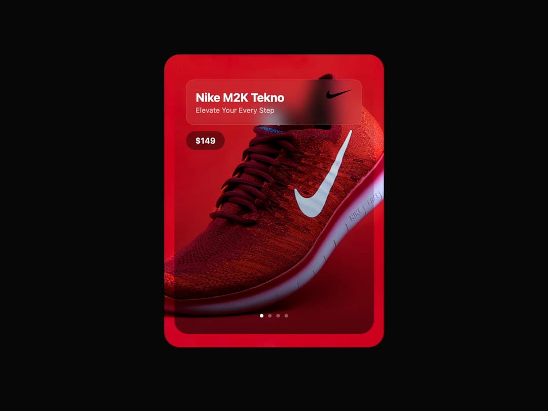
Product Card A sleek, image-centric card component designed to showcase products with a title, description, price, and brand logo. It features a gradient overlay for text readability and pagination dots for visual flair.
Built with React and Tailwind. Copy the prompt and paste it into Claude Code, Cursor or Lovable: your agent adds Card to your project and fits it to your theme.
Code
How Card is used: the demo's code. The component's own source comes with a free account.
Usage.tsx
import { InteractiveProductCard } from "@/components/ui/card-7"; // Adjust the import path

export default function InteractiveProductCardDemo() {
  return (
    <div className="flex min-h-screen w-full flex-col items-center justify-center gap-6 bg-background p-4">
      <InteractiveProductCard
        title="Nike M2K Tekno"
        description="Elevate Your Every Step"
        price="$149"
        imageUrl="https://cdn.21st.dev/assets/mirror/d9/d9c9632fe87053e4745e502df4d3b48480a53b2800e092f745d9e28a98f1995b.jpg"
        logoUrl="https://cdn.21st.dev/assets/mirror/54/54bb728904e14583753fcde786a9901b53ca9c8401ac207fb516841f9863c55a.svg"
      />
    </div>
  );
}More by Ravi Katiyar
View all

Animated Shader Hero
3.7K
Hero
3.1K
Circular Gallery
2.7K
Minimalist Hero
2.5K
Floating Icons Hero Section
1.9K
Glass Calendar
1.8K
Feature Carousel
1.7K
AI Image Generator Hero
1.4K