
About
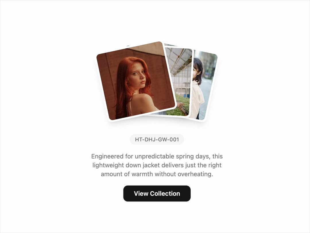
Product Showcase Card Interactive product display with stacked images, SKU, and description. Highlights key features while driving engagement with a strong CTA button. Ideal for e-commerce, fashion, or retail platforms.
Built with React and Tailwind. Copy the prompt and paste it into Claude Code, Cursor or Lovable: your agent adds Cards to your project and fits it to your theme.
Code
How Cards is used: the demo's code. The component's own source comes with a free account.
Usage.tsx
import React from 'react';
import { ProductShowcaseCard } from '@/components/ui/cards';

const Demo = () => {
  const images = [
    'https://cdn.21st.dev/assets/mirror/a2/a274943ea7b284ffcb66214957d1fde9db8b73b1d6830ebc804bea9a47c69fc7.jpg',
    'https://cdn.21st.dev/assets/mirror/8c/8c4caf174e91134a686a3a01c501cdf64a4eb31cede0f4afbacf00a4fab09cc9.jpg',
    'https://cdn.21st.dev/assets/mirror/16/1681cafd8d7f603d7c67ac6ad53084b8486201eaccabf32aa64b55cc3ce89df2.jpg',
  ];

  return (
    <div className="flex min-h-screen items-center justify-center bg-background">
      <ProductShowcaseCard
        images={images}
        tag="HT-DHJ-GW-001"
        title="Engineered for unpredictable spring days, this lightweight down jacket delivers just the right amount of warmth without overheating."
        buttonText="View Collection"
      />
    </div>
  );
};

export default Demo;
Dependencies
More by Ravi Katiyar
View all

Animated Shader Hero
3.7K
Hero
3.1K
Circular Gallery
2.7K
Minimalist Hero
2.5K
Floating Icons Hero Section
1.9K
Glass Calendar
1.8K
Feature Carousel
1.7K
AI Image Generator Hero
1.4K