
About
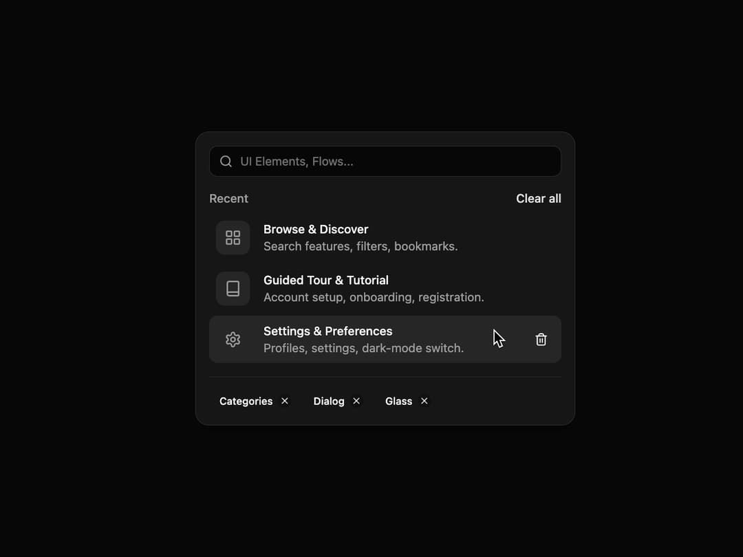
Interactive List An interactive list component designed for search interfaces or recent activity logs. It supports animated removal of list items and filter tags, is fully responsive, and adapts to shadcn themes out-of-the-box.
Built with React and Tailwind. Copy the prompt and paste it into Claude Code, Cursor or Lovable: your agent adds Interactive List to your project and fits it to your theme.
Code
How Interactive List is used: the demo's code. The component's own source comes with a free account.
Usage.tsx
import * as React from 'react';
import { Book, Settings, LayoutGrid, Search } from 'lucide-react';
import { InteractiveList } from '@/components/ui/interactive-list';
import { Card, CardContent, CardHeader } from '@/components/ui/card';
import { Input } from '@/components/ui/input';

// --- Initial data for the demo ---
const initialItems = [
  {
    id: 1,
    icon: <LayoutGrid className="h-5 w-5" />,
    title: 'Browse & Discover',
    description: 'Search features, filters, bookmarks.',
  },
  {
    id: 2,
    icon: <Book className="h-5 w-5" />,
    title: 'Guided Tour & Tutorial',
    description: 'Account setup, onboarding, registration.',
  },
  {
    id: 3,
    icon: <Settings className="h-5 w-5" />,
    title: 'Settings & Preferences',
    description: 'Profiles, settings, dark-mode switch.',
  },
];

const initialTags = [
  { id: 'cat', label: 'Categories', color: 'var(--orange-9)' }, // Using a placeholder for brand colors
  { id: 'dia', label: 'Dialog', color: 'var(--sand-9)' },
  { id: 'gla', label: 'Glass', color: 'var(--violet-9)' },
];

// Assuming you have these colors in your globals.css
// :root {
//   --orange-9: 24 9.8% 30%; /* Example dark theme color */
//   --sand-9: 38 6.9% 48.2%;
//   --violet-9: 262.1 83.3% 57.8%;
// }

export default function InteractiveListDemo() {
  const [items, setItems] = React.useState(initialItems);
  const [tags, setTags] = React.useState(initialTags);

  const handleRemoveItem = (id: string | number) => {
    setItems((prevItems) => prevItems.filter((item) => item.id !== id));
  };

  const handleRemoveTag = (id: string | number) => {
    setTags((prevTags) => prevTags.filter((tag) => tag.id !== id));
  };

  const handleClearAll = () => {
    setItems([]);
  };

  return (
    <div className="flex min-h-[450px] w-full items-center justify-center bg-background p-4">
      <Card className="w-full max-w-md rounded-2xl shadow-lg">
        <CardHeader className="p-4">
          <div className="relative">
            <Search className="absolute left-3 top-1/2 h-4 w-4 -translate-y-1/2 text-muted-foreground" />
            <Input
              placeholder="UI Elements, Flows..."
              className="w-full rounded-lg pl-9"
              aria-label="Search"
            />
          </div>
        </CardHeader>
        <CardContent className="p-4 pt-0">
          <InteractiveList
            title="Recent"
            actionText="Clear all"
            onActionClick={handleClearAll}
            items={items}
            onRemoveItem={handleRemoveItem}
            tags={tags}
            onRemoveTag={handleRemoveTag}
          />
        </CardContent>
      </Card>
    </div>
  );
}
Dependencies
More by Ravi Katiyar
View all

Animated Shader Hero
3.7K
Hero
3.1K
Circular Gallery
2.7K
Minimalist Hero
2.5K
Floating Icons Hero Section
1.8K
Glass Calendar
1.8K
Feature Carousel
1.7K
AI Image Generator Hero
1.4K