
About
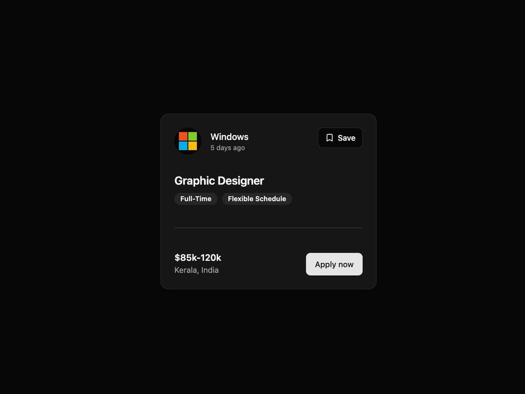
Job Card This component is designed to display job posting details in a clean, modern card layout. It's built to be highly reusable, accepting props for all dynamic content like the company logo, job title, salary, and tags. It includes a subtle entrance and hover animation for a more polished user experience.
Built with React and Tailwind. Copy the prompt and paste it into Claude Code, Cursor or Lovable: your agent adds Job Card to your project and fits it to your theme.
Code
How Job Card is used: the demo's code. The component's own source comes with a free account.
Usage.tsx
"use client";

import React from "react";
import { JobCard } from "@/components/ui/job-card"; // Adjust the import path as needed

export default function JobCardDemo() {
  const handleApply = () => {
    alert("Applying for the Graphic Designer position!");
  };

  const handleSave = () => {
    console.log("Job save status has been toggled.");
  };

  return (
    <div className="flex min-h-[500px] w-full items-center justify-center bg-background p-4">
      <JobCard
        companyLogo="https://cdn.21st.dev/assets/mirror/ae/ae4a71363f168f06d335ba7a58a5664270714c712f76ae60563c9d524978ea2e.svg"
        companyName="Windows"
        postedAt="5 days ago"
        jobTitle="Graphic Designer"
        tags={["Full-Time", "Flexible Schedule"]}
        salaryRange="$85k-120k"
        location="Kerala, India"
        onApply={handleApply}
        onSave={handleSave}
        isInitiallySaved={false} // You can set this to `true` to see the default saved state.
      />
    </div>
  );
}
Dependencies
More by Ravi Katiyar
View all

Animated Shader Hero
3.7K
Hero
3.1K
Circular Gallery
2.7K
Minimalist Hero
2.5K
Floating Icons Hero Section
1.9K
Glass Calendar
1.8K
Feature Carousel
1.7K
AI Image Generator Hero
1.4K
More in Buttons
View all
Button Save
46

Button
20

Eclipse Button
5

Button
6

Button
14

Button Group
37

Button
32
Split Button
32

