
About
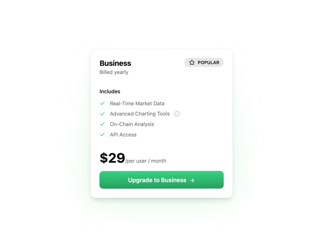
Pricing Card Component This component is designed to be highly reusable and customizable. You can control all its content through props, including the plan name, features list (with optional tooltips), pricing, and call-to-action text. The 3D tilt effect is self-contained and works out of the box.
Built with React and Tailwind. Copy the prompt and paste it into Claude Code, Cursor or Lovable: your agent adds Pricing Card to your project and fits it to your theme.
Code
How Pricing Card is used: the demo's code. The component's own source comes with a free account.
Usage.tsx
import { PricingCard } from "@/components/ui/pricing-card-3";

const PricingCardDemo = () => {
  const businessFeatures = [
    { name: "Real-Time Market Data", included: true },
    {
      name: "Advanced Charting Tools",
      included: true,
      description: "Access customizable timeframes, technical indicators, and historical data to uncover actionable insights."
    },
    { name: "On-Chain Analysis", included: true },
    { name: "API Access", included: true },
  ];

  return (
    <div className="flex min-h-screen w-full items-center justify-center bg-background p-4">
      <PricingCard
        planName="Business"
        planDescription="Billed yearly"
        price={29}
        priceFrequency=" per user / month"
        features={businessFeatures}
        ctaText="Upgrade to Business"
        isPopular={true}
      />
    </div>
  );
};

export default PricingCardDemo;
Dependencies
More by Ravi Katiyar
View all

Animated Shader Hero
3.7K
Hero
3.1K
Circular Gallery
2.7K
Minimalist Hero
2.5K
Floating Icons Hero Section
1.9K
Glass Calendar
1.8K
Feature Carousel
1.7K
AI Image Generator Hero
1.4K
More in Pricing
View all
Pricing Section
582

Pricing Cards
31

Pricing Card
535

Pricing Section
173
pricing section
158
Single Pricing Card
795

Pricing
125
Glowing Pricing Tiers
45


