
About
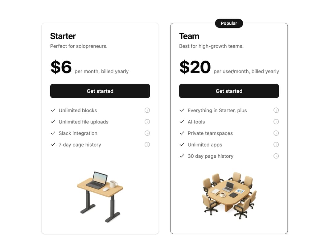
Pricing Section This is a responsive and animated pricing section component. It uses framer-motion for smooth, staggered animations and is built with shadcn/ui components like Card, Button, and Badge for a consistent look and feel. The component is highly reusable, with all content and features managed through props.
Built with React and Tailwind. Copy the prompt and paste it into Claude Code, Cursor or Lovable: your agent adds Pricing Section to your project and fits it to your theme.
Code
How Pricing Section is used: the demo's code. The component's own source comes with a free account.
Usage.tsx
import { PricingCard } from "@/components/ui/pricing-section"; // Adjust the import path

const pricingPlans = [
  {
    planName: "Starter",
    description: "Perfect for solopreneurs.",
    price: 6,
    priceFrequency: "per month, billed yearly",
    features: [
      "Unlimited blocks",
      "Unlimited file uploads",
      "Slack integration",
      "7 day page history",
    ],
    buttonText: "Get started",
    imageSrc: "https://www.thiings.co/_next/image?url=https%3A%2F%2Flftz25oez4aqbxpq.public.blob.vercel-storage.com%2Fimage-m1zsJPdG8gluBoQ6Sj7VPAsI1uWAqE.png&w=1000&q=75",
    popular: false,
  },
  {
    planName: "Team",
    description: "Best for high-growth teams.",
    price: 20,
    priceFrequency: "per user/month, billed yearly",
    features: [
      "Everything in Starter, plus",
      "AI tools",
      "Private teamspaces",
      "Unlimited apps",
      "30 day page history",
    ],
    buttonText: "Get started",
    imageSrc: "https://www.thiings.co/_next/image?url=https%3A%2F%2Flftz25oez4aqbxpq.public.blob.vercel-storage.com%2Fimage-xa53bct38evL95XiWv4u5NKIfD6l4O.png&w=1000&q=75",
    popular: true,
  },
];

export default function PricingDemo() {
  return (
    <div className="flex min-h-screen w-full items-center justify-center bg-background p-4">
      <div className="grid max-w-4xl grid-cols-1 gap-8 md:grid-cols-2">
        {pricingPlans.map((plan) => (
          <PricingCard key={plan.planName} {...plan} />
        ))}
      </div>
    </div>
  );
}
Dependencies
More by Ravi Katiyar
View all

Animated Shader Hero
3.7K
Hero
3.1K
Circular Gallery
2.7K
Minimalist Hero
2.5K
Floating Icons Hero Section
1.9K
Glass Calendar
1.8K
Feature Carousel
1.7K
AI Image Generator Hero
1.4K
More in Pricing
View all
Pricing Section
582

Pricing Cards
31

Pricing Card
535

Pricing Section
173
pricing section
158
Single Pricing Card
795

Pricing
125
Glowing Pricing Tiers
45


